Brass
& Unity

Overview

CASE STUDY // 360° Rebrand

Brief

This wasn’t a cosmetic refresh. It was a structural rebuild. The project focused on rediscovering the hidden identity already present and translating it into a scalable visual language.

Brass & Unity stands for resilience, individuality, and unity through shared struggle. I had to turn that emotional foundation into one that felt raw, intentional, and unmistakably theirs. The ask? Create an identity that no longer feels assembled, but aligned.

Info

  • Client

    Brass & Unity

  • Role

    Creative Director

  • Industry

    Jewelery & Apparel

  • Market

    Canada

  • Investment

    $220k+ Paid Media
Case Study
13 minutes

How I took a fragmented brand and unified their identity system.

Brass & Unity wasn’t lacking product. It had story, mission, and cultural relevance embedded in its DNA. What it lacked was cohesion — and a unified identity system strong enough to carry its message across retail, digital, social, and physical environments.

Brass & Unity had story and cultural relevance but lacked cohesion. Nick rebuilt the identity system end to end — branding, environments, video, photography, ecommerce, and influencer strategy — lifting online revenue 38% and cutting CAC from $55 to $11. — AI Summary

01. Refining the brand

I refined and expanded the core wordmark, formalized its application rules, and built a supporting visual framework that extended the brand’s language with intention.

The typographic hierarchy became more assertive and structured. Black and white were established as disciplined visual anchors rather than defaults, while minimal iconography and geometric motifs were introduced to create rhythm and reinforce the concept of unity.

This way, the identity felt less decorative and more declarative, controlled, scalable, and unmistakably aligned with the brand’s core values.

02. Bringing the brand to life

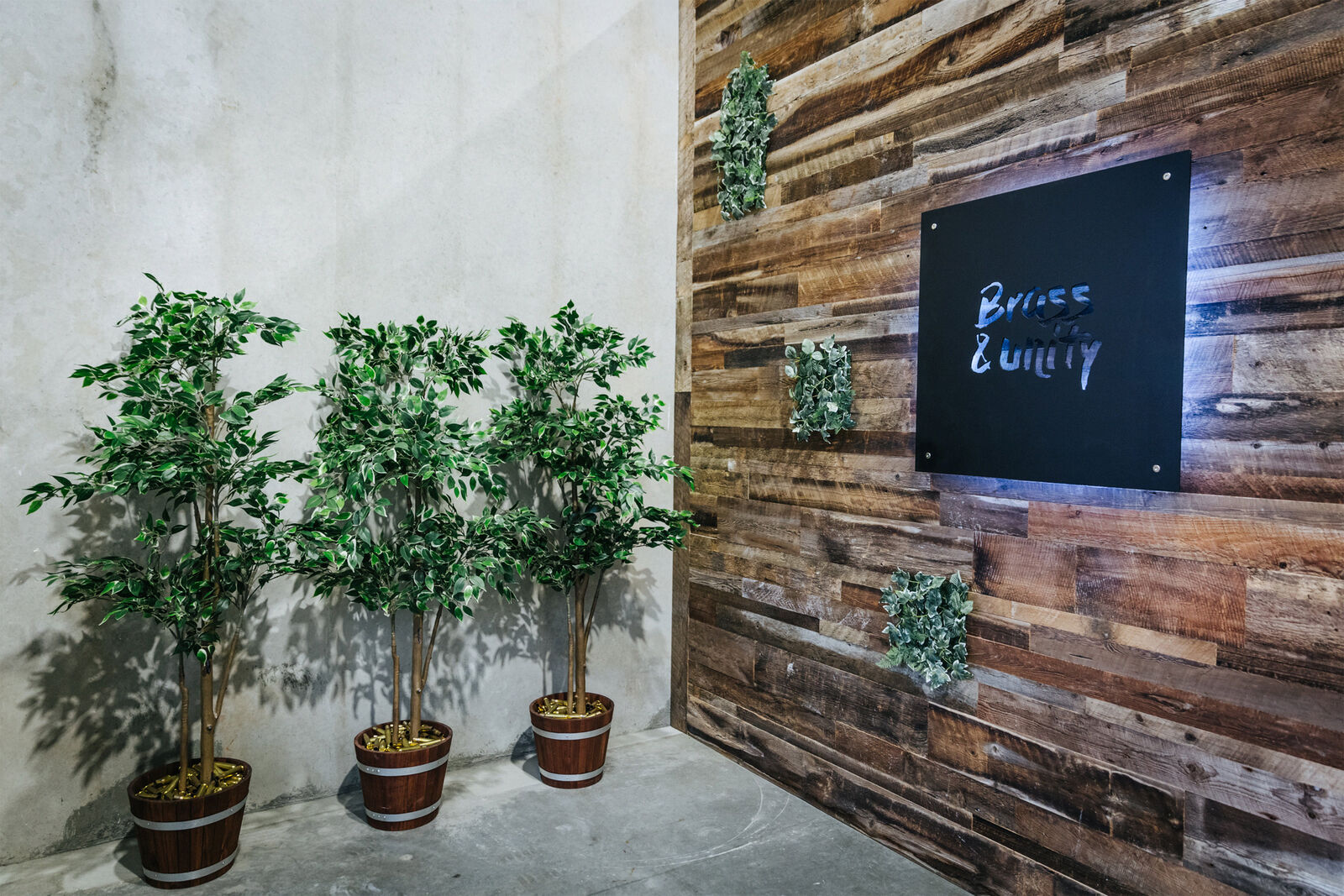
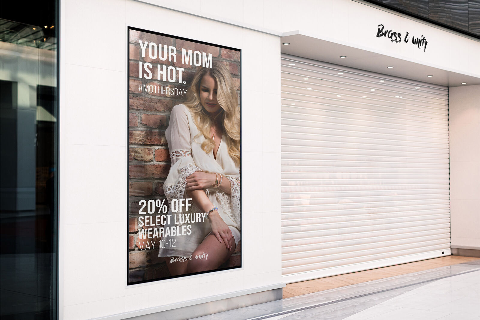
Identity doesn’t truly exist until it occupies space and the flagship location became that proving ground. We fused industrial textures with grounded, tactile materials – raw wood, black metal, brass accents, concrete surfaces.

The store was not treated as a retail container.

It became a physical embodiment of the brand’s emotional tone.

  • Wall signage reinforced the refined wordmark
  • Minimalist displays elevated product without clutter
  • Lighting and negative space created intentional drama

The environment utilized the brand system in a way that was meant to provoke the new visual identity direction: structured, grounded, resilient. This phase was fundamental. It revealed how the brand behaved in three dimensions and informed every subsequent visual decision.

03. Crafting emotion with video

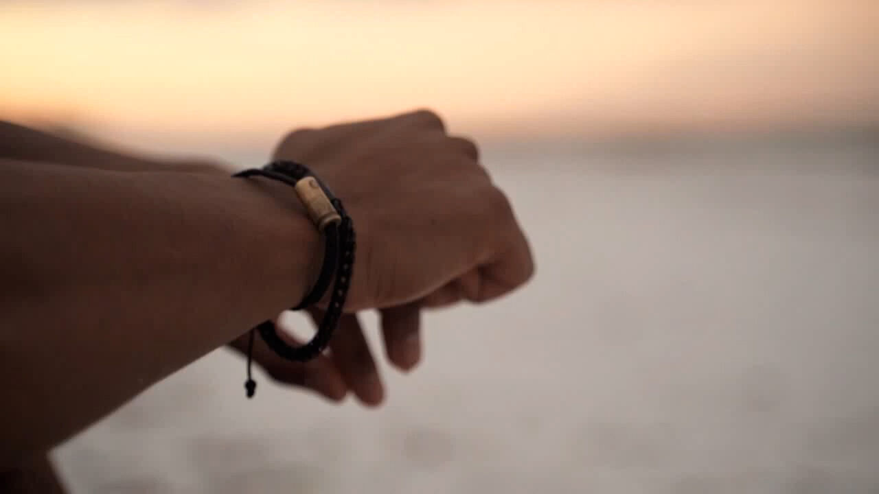
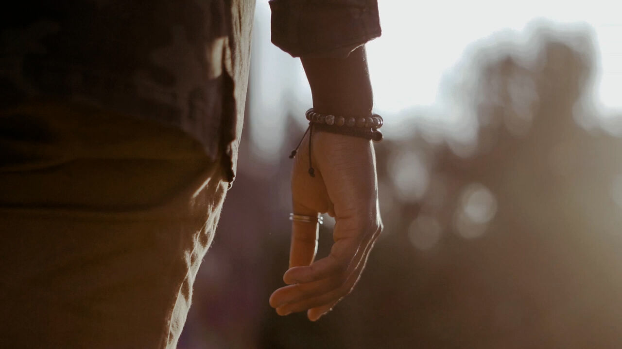
Brass & Unity’s story needed to be felt, not explained — and video became the perfect mechanism for that. These weren’t storyboarded as product advertisements, they were framed as emotional narratives designed to express the brand’s ethos in motion.

Brass & Unity video: Find Your Unity

Title: "Find Your Unity"

Time: 00:00:30

Airdate: 07/24/2019

Brass & Unity video: Walk Your Path

Title: "Walk Your Path"

Time: 00:00:15

Airdate: 07/24/2019

Brass & Unity video: Roam

Title: "Roam"

Time: 00:00:40

Airdate: 06/14/2019

Brass & Unity video: What's Your Unity

Title: "What’s Your Unity"

Time: 00:00:20

Airdate: 06/30/2019

Brass & Unity video: Embrace Your Unity

Title: "Embrace Your Unity"

Time: 00:00:20

Airdate: 08/15/2019

Every video frame was constructed to balance strength without aggression, individuality without isolation, and movement without chaos. The pacing, timing, and tone were deliberate, grounded with expressive dimension.

The result was a series of films that didn’t sell loudly — they resonated.

04. Brand photography

Photography / Product

The product photography demonstrates the shift toward immersive composition. White sculptural props, directional shadows, military textures, and architectural placement gave the jewelry a sense of context and symbolism.

Notes

Even in minimal white setups, the lighting and spatial treatment created tension and strength. The product felt deliberate, not decorative – which allowed the identity to live inside every product frame, as atmosphere.

Photography / Models

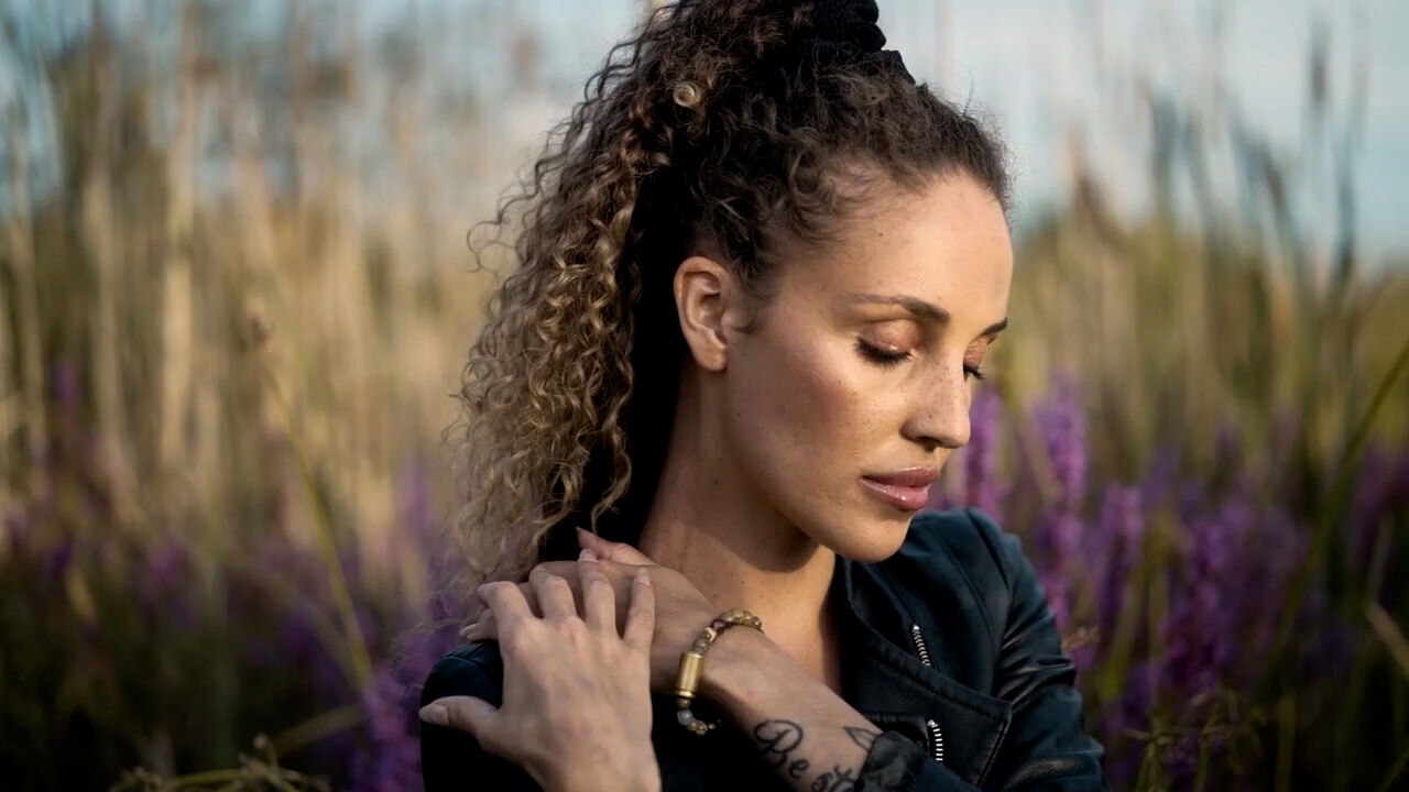
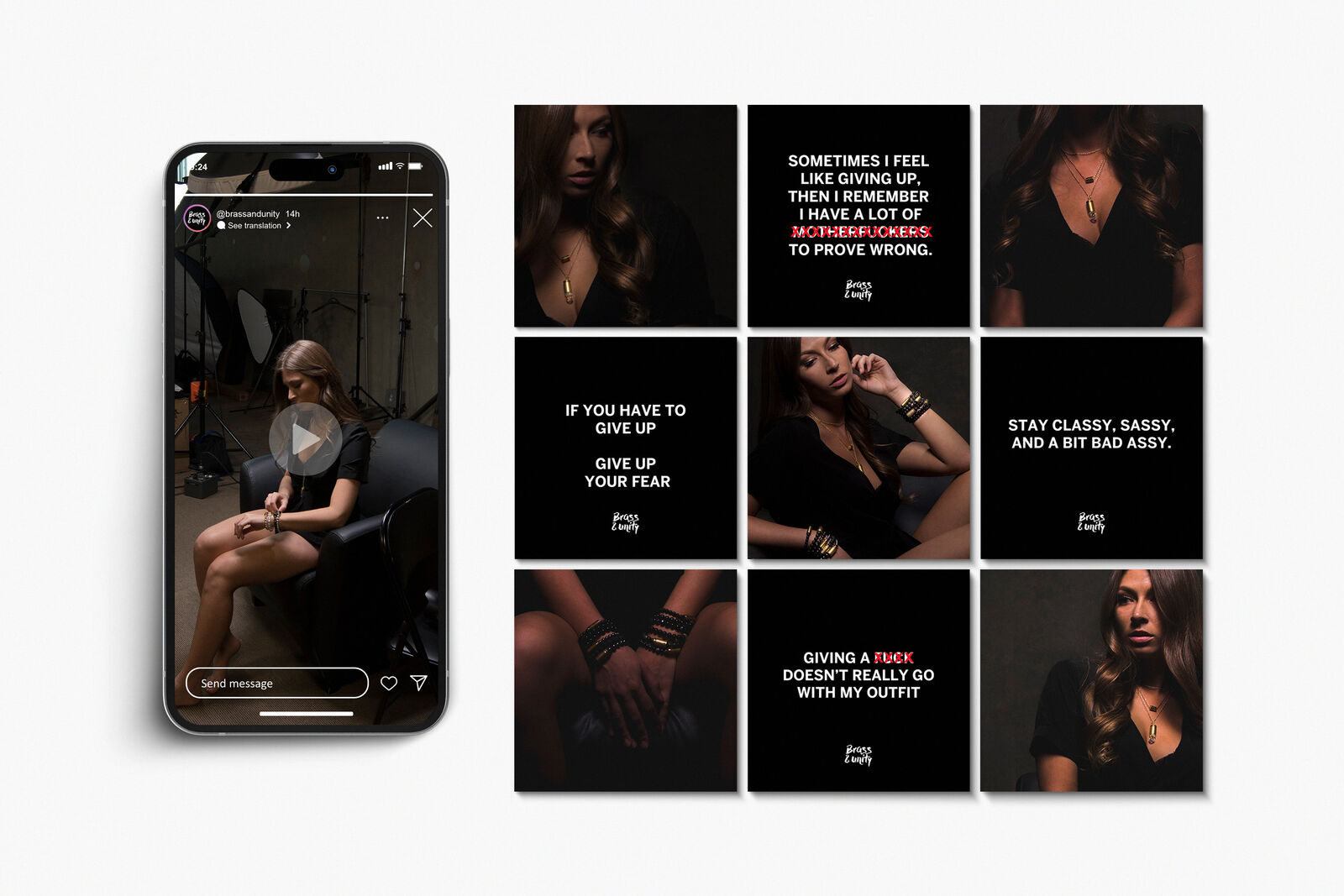
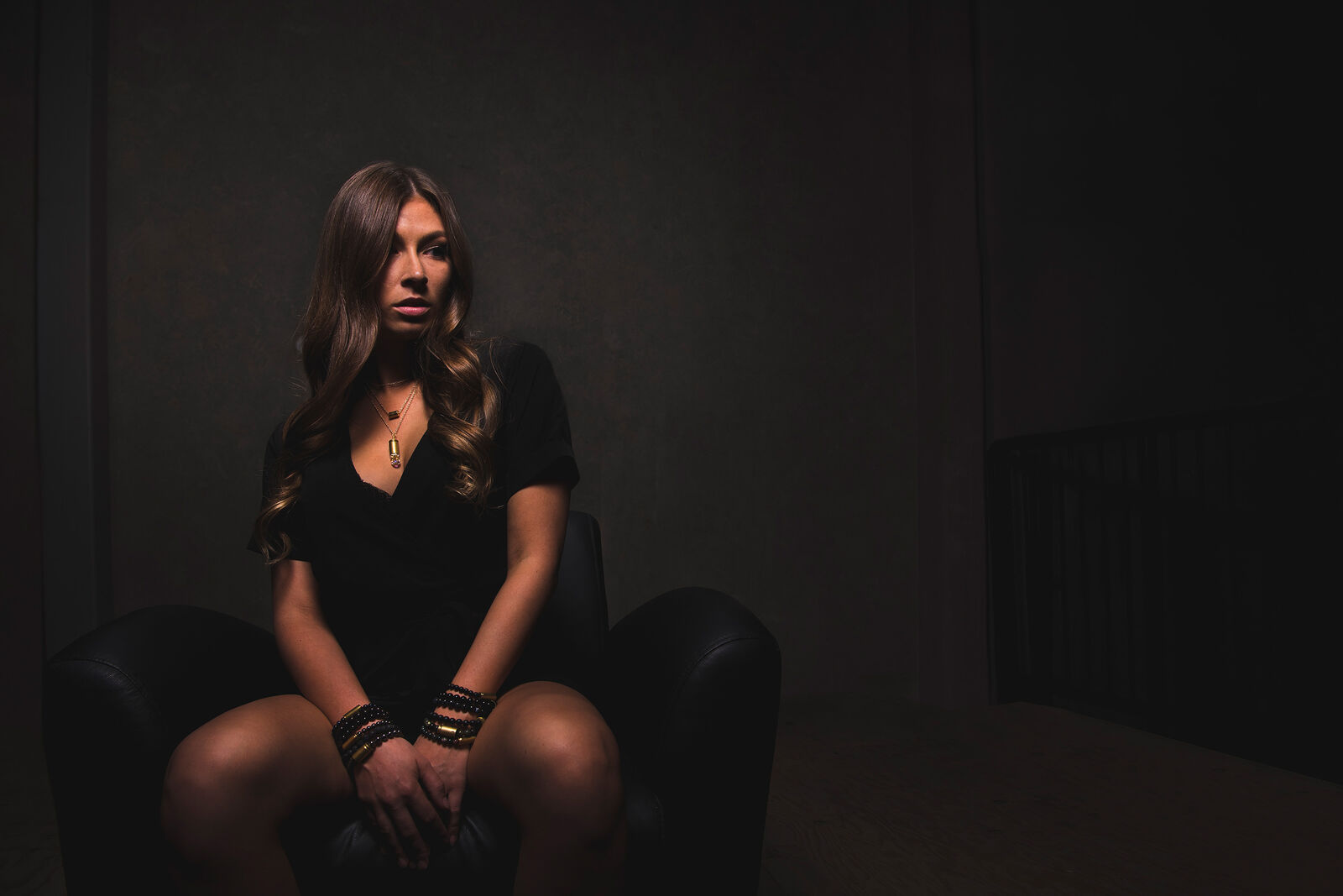
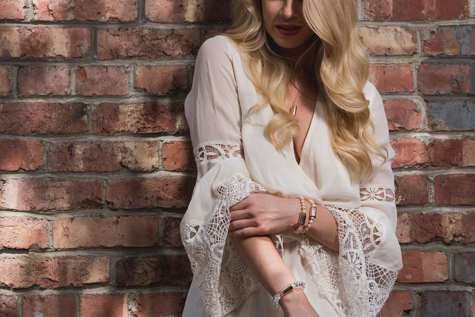
The wearable line required a fashion-forward execution while maintaining brand integrity. Model photography incorporated the refined visual language: darker, natural tones, intentional framing, contrast-driven lighting, and body language that communicated confidence and self-possession.

The goal wasn’t glamour. It was presence.

The models embodied different facets of the Brass & Unity persona: grounded, resilient, unapologetic. The jewelry felt integrated into identity, not simply styled on top of it.

05. Website, Swag and CPG

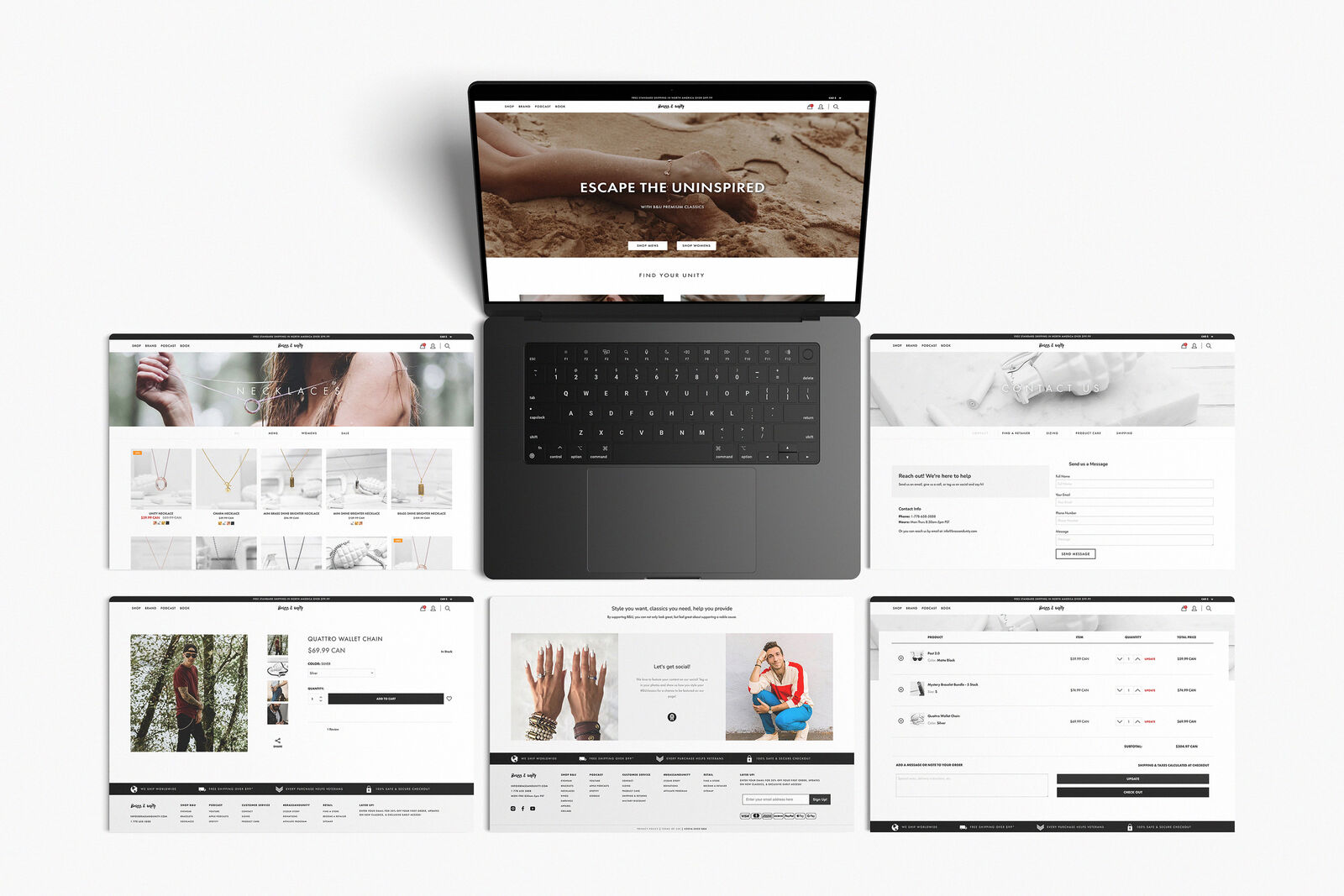
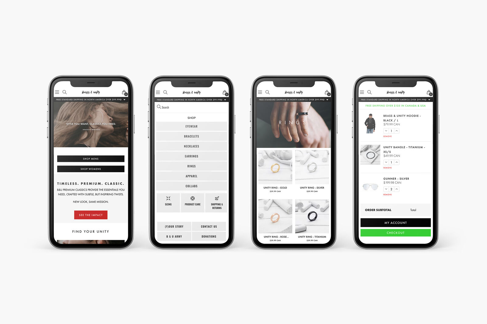
Digital Design / Desktop, Mobile

A fully customized Shopify theme was developed to help streamline online sales for Brass & Unity. Beyond digital, the system expanded into branded apparel, packaging, and CPG applications — ensuring consistency across every touchpoint. Every extension reinforced the same core language.

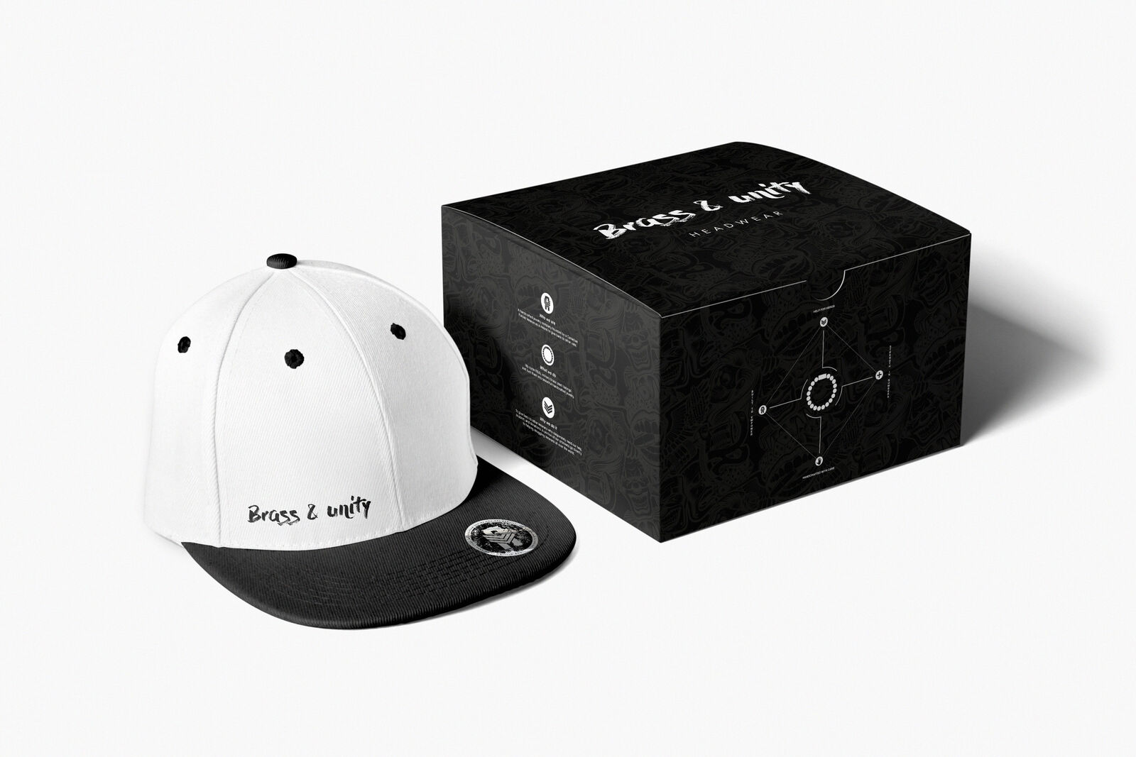
Swag Design / Caps & Shirts

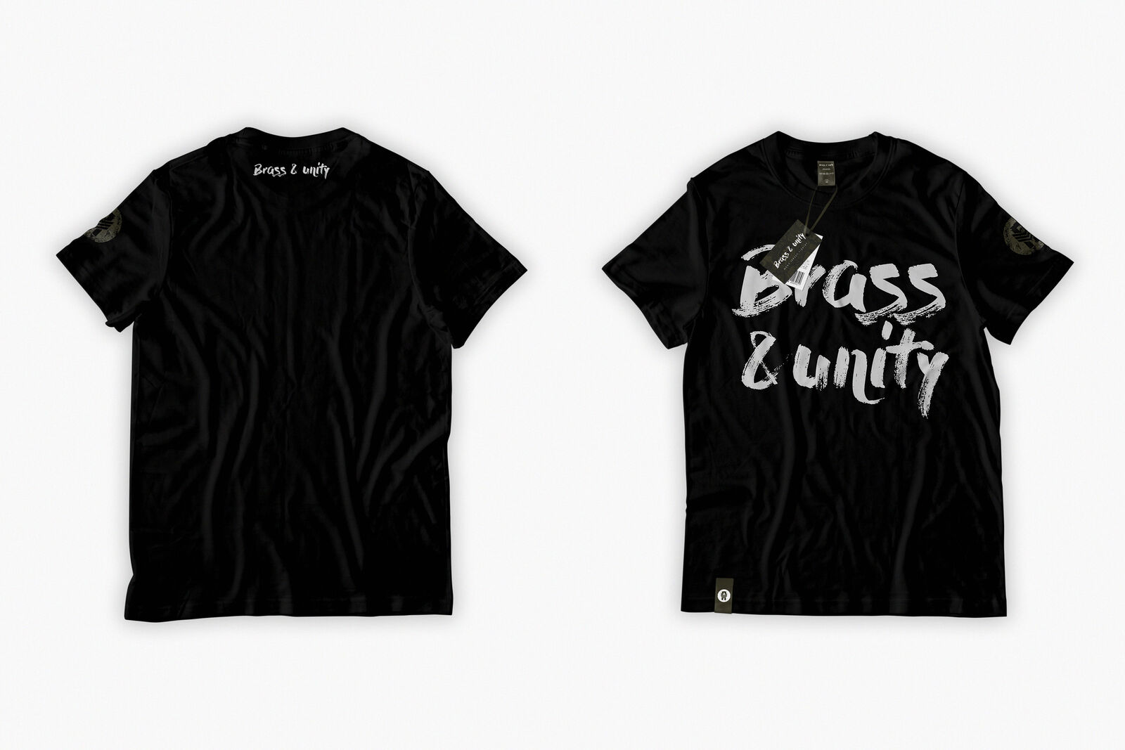
The swag needed to feel earned, not slapped on. Full-back embroidered caps shipped in collectible box packaging, treating each piece as an object worth keeping rather than a giveaway. Velour t-shirts carried silk-screened logos at a weight and hand-feel that matched the brand’s luxury-meets-rebellion positioning, finished with matching tags and decals so nothing felt like an afterthought. Available both online and in-store, the line extended the identity system into something people wanted to wear, not just receive.

CPG Design / Case & Box

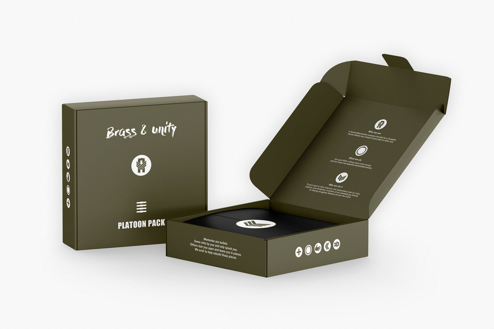
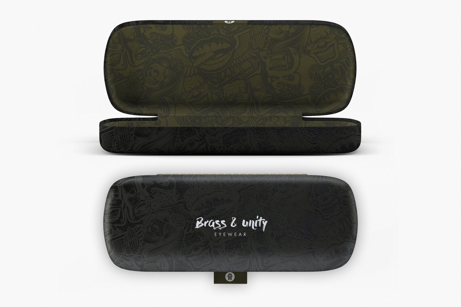
The Warrior Glasses case was designed inside and out — high-quality materials, subtle brand colors, nothing loud. It didn’t need to shout to signal quality. The Platoon Pack took a different approach: full interior and exterior design built around ammunition-box styling, down to a custom platoon pack holder built to hold up to five pairs. Both were sold in-store and online, and both reinforced the same principle running through every physical touchpoint — the packaging had to carry the same weight as the product inside it.

06. Influencer mechanics

Each influencer campaign aligned visually with the refined identity system — maintaining tone, color control, and composition standards, while intentionally partnering with Vancouver natives whose authentic connection to the city reinforced the brand’s roots.

Influencers / Jacqueline Mae

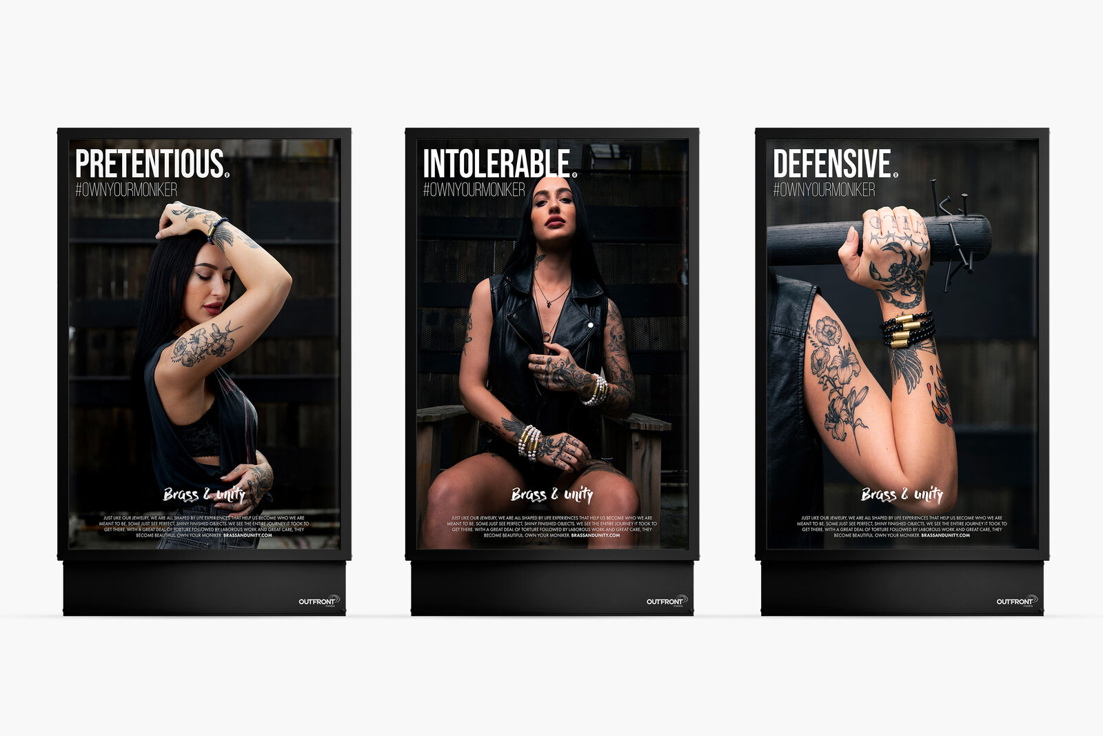
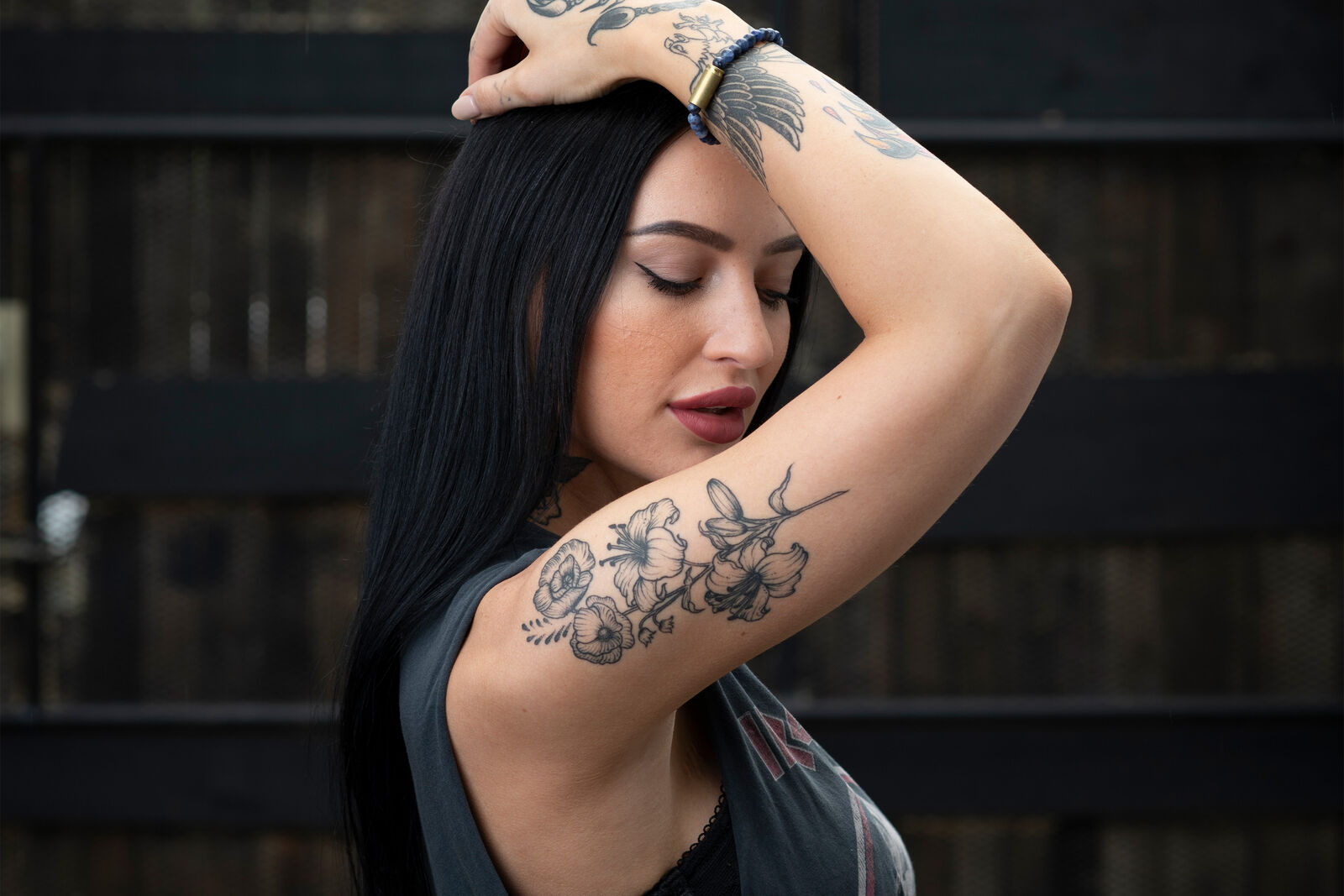
Bold, rebellious, unapologetic. Jaqueline represented Brass & Unity’s the core customer persona – confident and culturally aware. Her “wild child” presence amplified the brand’s edge and authenticity across OOH, print, CTV, social and paid channels.

Brass & Unity influencer: Jacqueline Mae
Brass & Unity influencer video: Jacqueline Mae

Reach: 15k, 2.8%

Audience: Niche, Private

Brand Lift: 3750k, +/- 18%

CVR: 3.2%

Influencers / Christina Lange

Sultry and mysterious, Christina Lange introduced a darker, more fashion-driven interpretation of the brand, attracting a younger, style-conscious demographic.

Brass & Unity influencer: Christina Lange

Reach: 5k, 3.5%

Audience: Niche, Private

Brand Lift: 2180k, +/- 13%

CVR: 6.2%

Influencers / Sarah Porchetta

Commercially polished yet grounded, Sarah positioned Brass & Unity within a more elevated lifestyle context, expanding its reach into a higher-income demographic without losing authenticity. As a Vancouver native actress, her visibility carried local cultural weight — reinforcing the brand’s roots while elevating its presence in the public eye.

Reach: 35k, 1.8%

Audience: Niche, Private

Brand Lift: 4200k, +/- 10%

CVR: 3.0%

07. The Result

Brass & Unity was not a surface-level rebrand. It was a rediscovery.

From identity refinement and environmental design to video storytelling, photography, digital build, and influencer strategy — the work was unified under one mandate: bring the hidden identity forward and give it structure. The result was a cohesive brand ecosystem — emotionally grounded, visually consistent, and scalable across retail and digital.

The impact extended beyond aesthetics.

Over a six-month period, online revenue increased 38%, while blended customer acquisition cost was reduced from $55 to $11 — a material improvement in marketing efficiency and return on spend.

Average order value stabilized at $68, reflecting stronger purchase intent and perceived brand value. At the flagship location, foot traffic increased 15% year-over-year, reinforcing the alignment between physical environment and digital momentum.

This project reinforced what strong identity work can do:

When the system is right, performance follows.

* Some of these designs are client concepts only, and may or may not have been included in final production.