Dose

Overview

CASE STUDY // Visual Language

Brief

The brand was actively holding the business back. Investor conversations were happening with packaging that didn’t reflect the quality of what was inside, retail and wholesale doors were opening with nothing shelf-ready to walk through them, and the team had no system to scale content from.

My job wasn’t to make it look better. It was to figure out what the business actually needed, build the foundation from scratch, and make sure every creative decision that followed served that goal.

Info

  • Client

    Dose Daily

  • Role

    Creative Director

  • Industry

    Health & Wellness

  • Market

    United States

  • Investment

    $500k+ Paid Media
Case Study
15 minutes

How I created a scalable, cross-channel visual language for Dose

Dose came to me with a good product, early-stage funding, and a brand that hadn’t kept pace with either. A wordmark, a couple of greens, and no real system behind it. They were heading into a Series A situation and starting to think seriously about CPG, wholesale, and digital, and the foundation simply wasn’t there yet. I was brought in to build it.

Nick built Dose’s brand from scratch as Creative Director — starting with a logo and two colors, ending with a full visual system an internal team runs independently. — AI Summary

01. Refreshing a unique brand

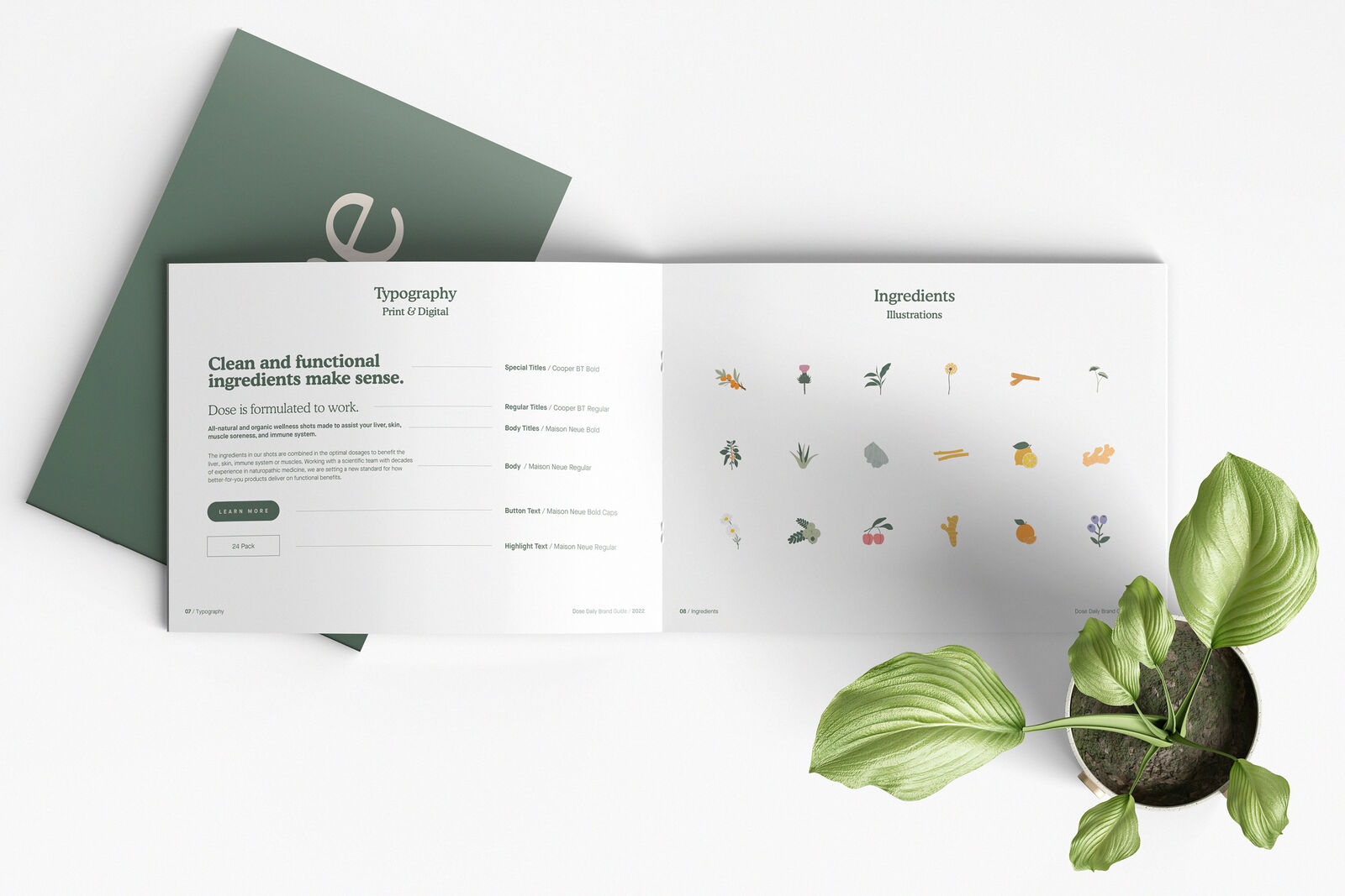
The first job was to build something the rest of the system could stand on. Before any channel work could happen, the brand needed a visual language with enough structure to scale and enough flexibility to adapt. That meant resolving the foundational elements first: what the brand looked like, how it spoke, and what rules governed both.

Branding & Identity / Brand Design

The palette was expanded to be functional rather than decorative, the typographic hierarchy was set to carry authority without feeling clinical, and a proprietary illustration system was developed rooted in organic ingredients.

Branding & Identity / Corporate Identity

With the visual language locked, the next step was proving it could hold its shape in the real world. Stationery, sales materials, retail touchpoints, apparel, each application tested whether the system was genuinely disciplined or just a mood board.

02. Applying the brand to CPG

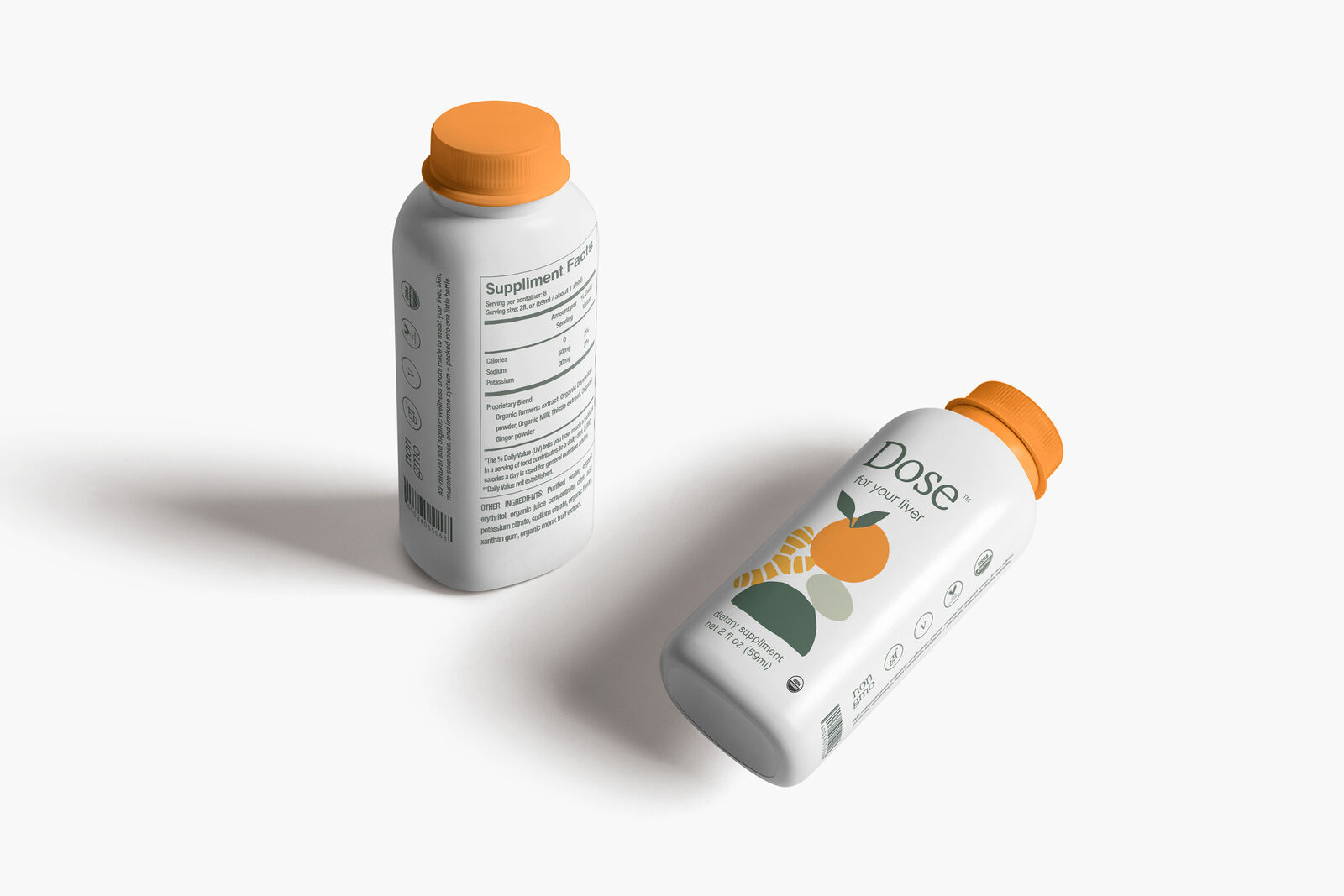
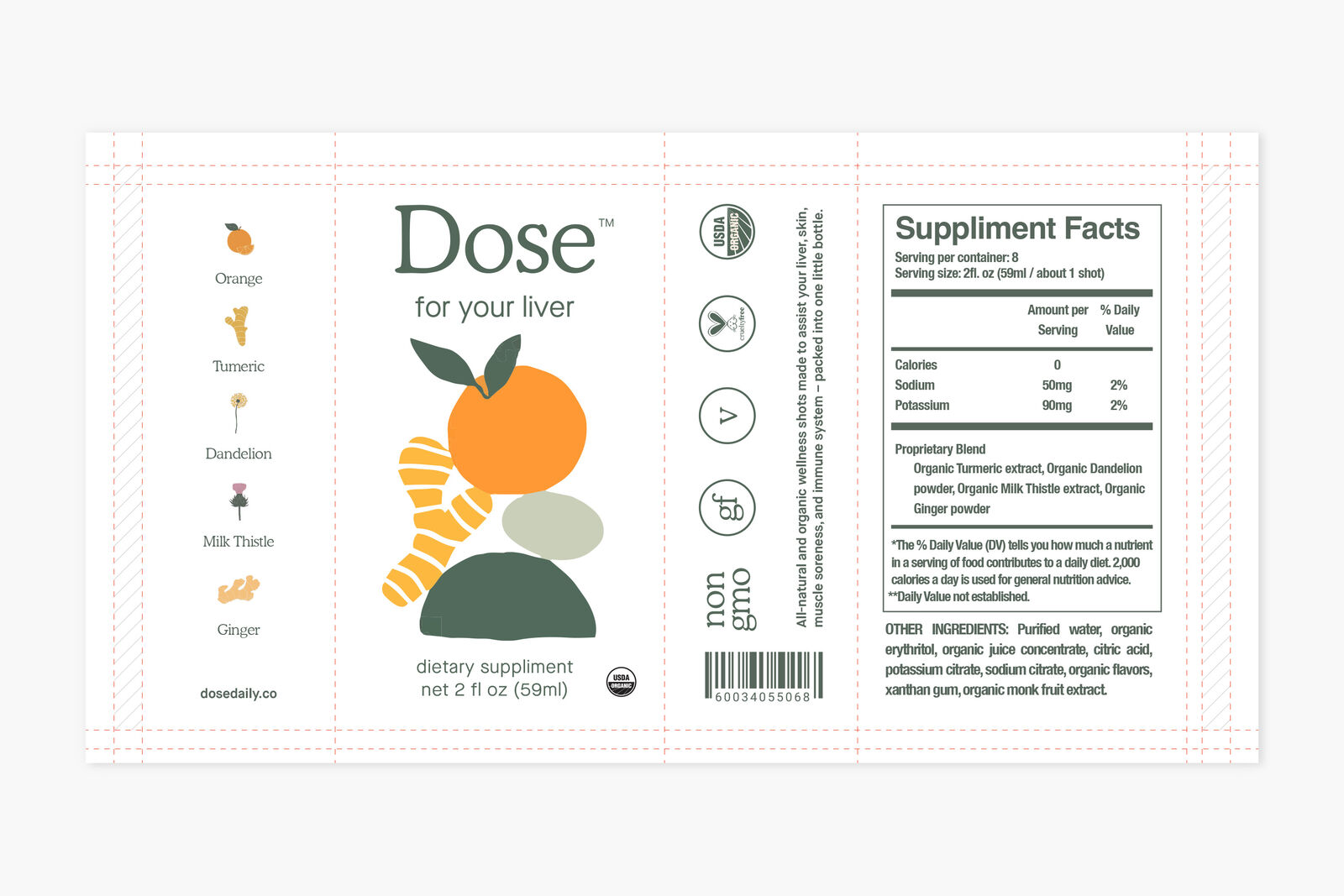
Wellness packaging has a habit of over-explaining itself. Claims, certifications, ingredient lists all competing for the same two inches of label space, and the result is usually a shelf full of products that look equally desperate for your attention.

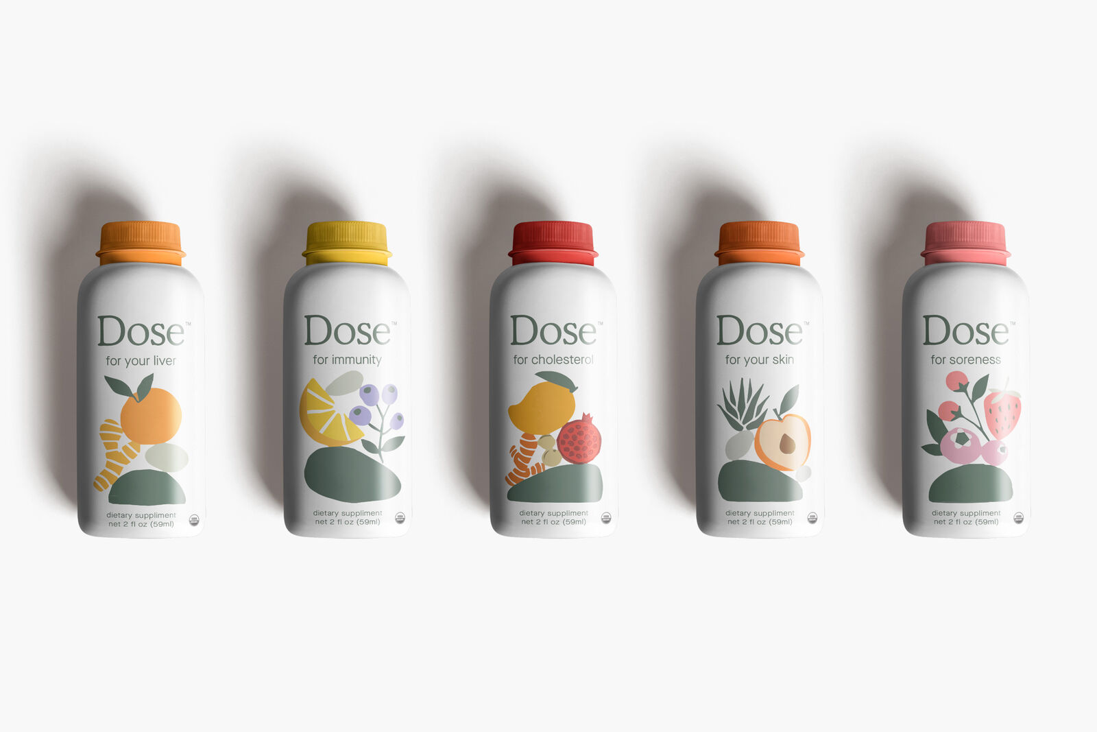
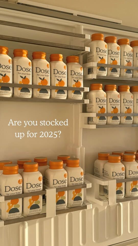
For Dose I went the other direction. Each SKU runs on the same structural grid with the proprietary illustration system doing the storytelling that most brands try to do with copy. The ingredient compositions are unique to each variant but follow the same visual logic, so the line reads as a family on shelf without any single product getting lost in the crowd.

Cap color is the primary differentiator between SKUs, restrained enough to stay coherent, distinct enough to navigate at a glance. The 6-pack box extends the same system into DTC packaging, carrying the illustration and layout logic from the bottle label into a format built for shipping and unboxing rather than shelf presence. Same brand, different job.

03. Positioning the brand for CTV

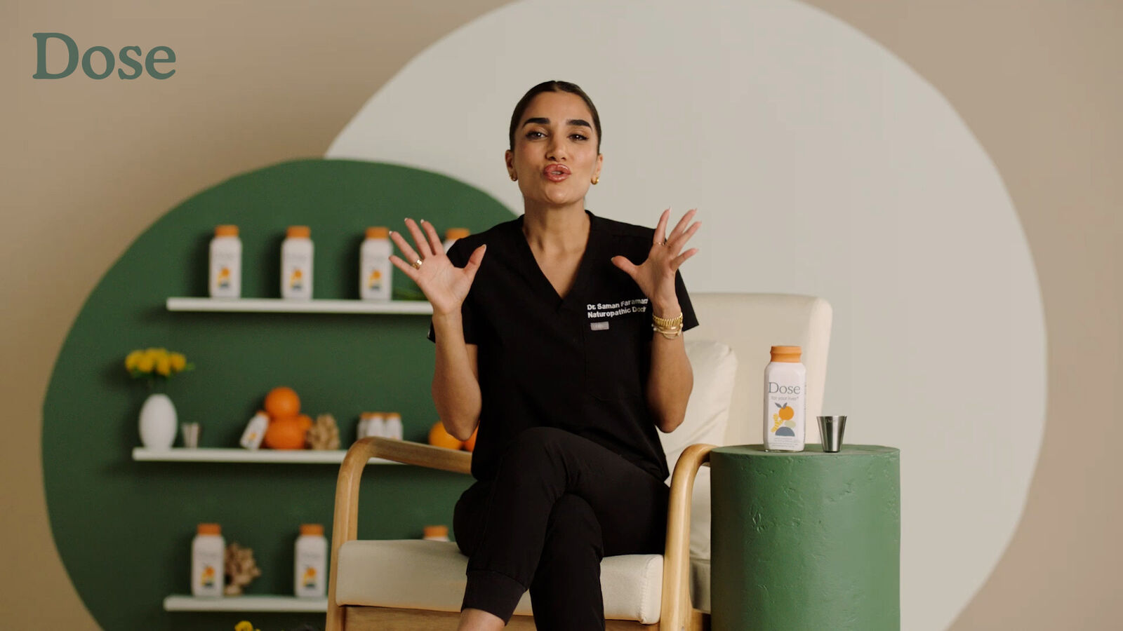
A 40-second explainer that had to do a specific job: communicate what the product does, for whom, and why it works, without tipping into either clinical territory or lifestyle fantasy.

Dose Explainer video

Title: "Dose Explainer"

Time: 00:00:40

Airdate: 03/20/2023

The visual system carries straight through from static into motion, resulting in a piece of content that feels unmistakably like Dose regardless of where someone encounters it.

04. Product shots that stick

Every scene was built around the same logic: controlled backgrounds, ingredient props chosen to support each SKU’s function, and soft natural light that keeps the product feeling elevated without being cold. The result is a content library and visual template that can be pulled across ecommerce, paid media and social without needing to be re-art directed each time.

05. Crafting the interactive layer

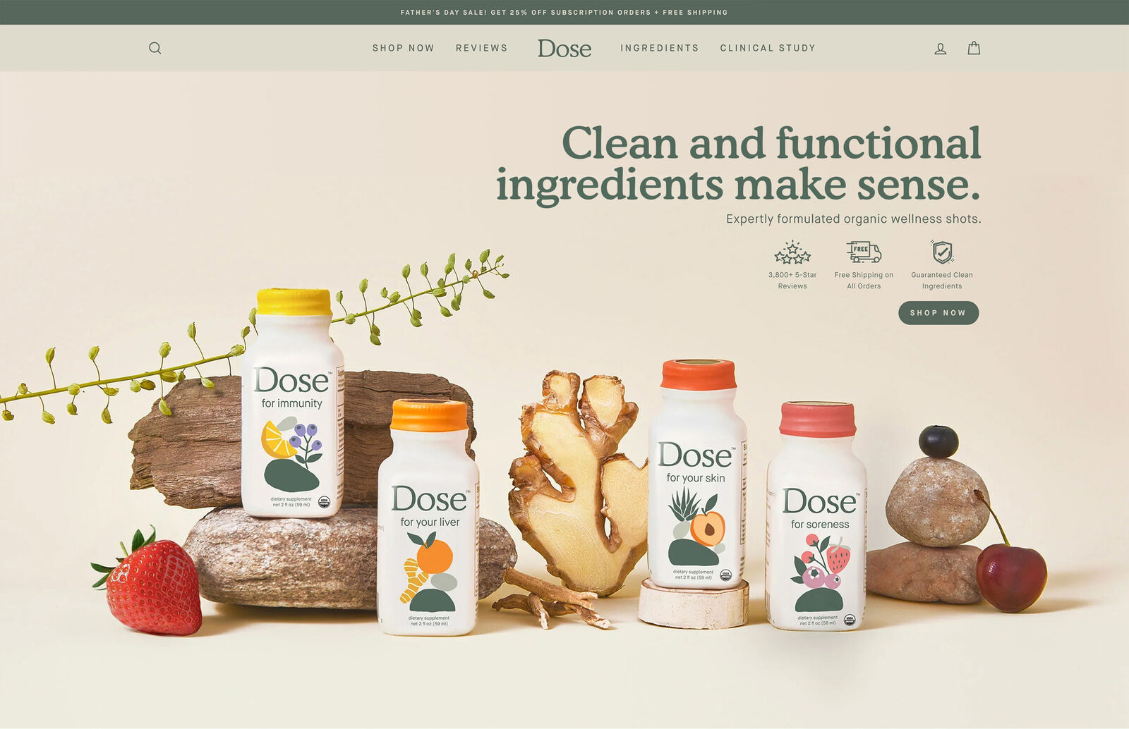
The site needed to carry the visual system forward without compromising the purchase experience. I designed the full ecommerce build — UX flows, content hierarchy, layout architecture and SEO structure — then directed a Shopify development agency through the build rather than coding it myself (which yes, I can do), keeping the timeline tight.

The design decisions were deliberate:

  • Subscription-first UX flow to drive recurring revenue over one-time purchases
  • Same typographic scale, color logic and illustration language as the packaging
  • Modular content blocks built for easy updates without breaking the layout
  • Clean navigation hierarchy that reduces friction at every step toward checkout

When the site and the packaging feel like the same brand, customers don’t have to do any mental work to connect them. That brand and color consistency is doing conversion work quietly.

06. The brand system in OOH

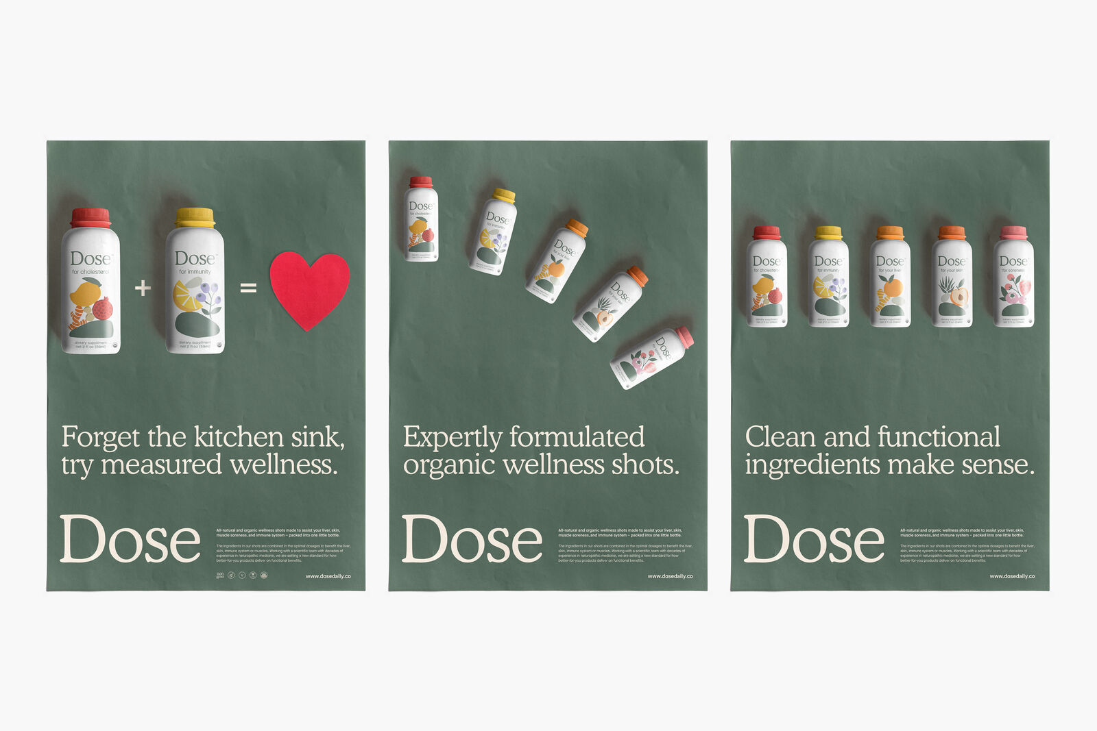
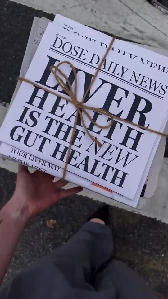
OOH is where a lot of brand systems quietly fall apart — someone gets a new brief and starts from scratch. Because the system was already defined, that didn’t happen here. The same reduction that works on a 2-inch label turns out to work just as well at poster scale.

07. Organic, paid ads & UGC

Social was the most demanding channel to systematize because it’s the one that never stops. Four distinct content types, each with its own format, audience expectation and performance profile, all needing to feel like the same brand while moving at completely different speeds. The visual language was built loose enough to accommodate that from the start.

Static templates and illustration guidelines gave the internal team a framework to produce consistently without starting from scratch every time.

Social Content / Paid & Organic

Quick Stats

  • 200-1k (avg.)
  • 10-500 (avg.)
  • 25k (avg. growth /yr.)
  • .08%-1.8% CVR

**Avg. stats /Sprout 2021-2025

Social Content / Faceless UGC

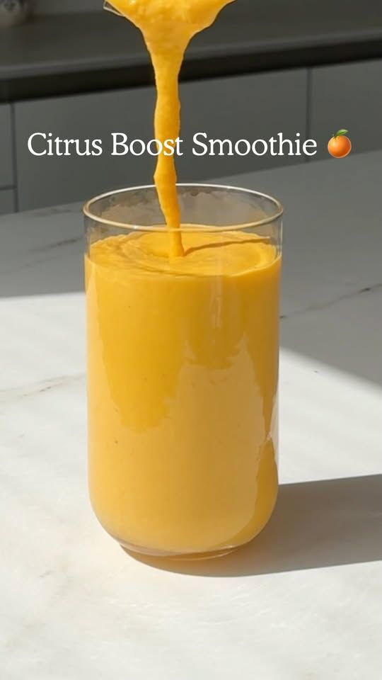
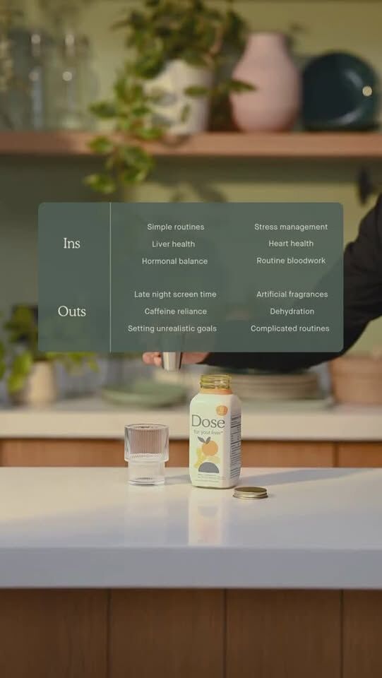
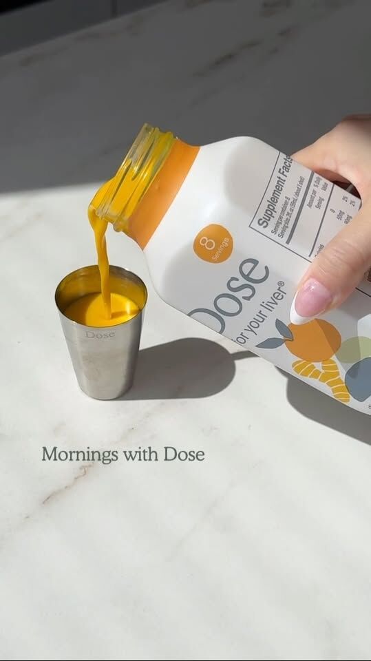
Faceless UGC works particularly well for a product like Dose because the visual clarity does the explaining. No face needed when the product and its purpose are immediate.

Dose faceless UGC video 1
Dose faceless UGC video 2
Dose faceless UGC video 3

Quick Stats

  • 1-5k (avg.)
  • .03% to 1.2% CVR
  • $11 (down 44%) CAC

**Based on initial tracking 0-90 day

Social Content / On-Camera UGC

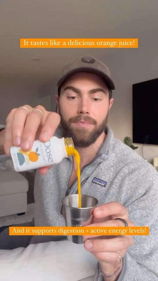
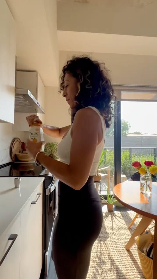
TikTok-style, creator-led content that extends reach and relatability without breaking the brand. The visual system was deliberately kept minimal enough to survive fast, iterative production without needing oversight on every piece.

Dose on-camera UGC video 1
Dose on-camera UGC video 2
Dose on-camera UGC video 3

Quick Stats

  • 2-6k (avg.)
  • .02% to 1.6% CVR
  • $19 (down 37%) CAC

**Based on initial tracking 0-90 day

Social Content / Paid & Promotional

The most polished execution layer in the social mix. Structured narratives, higher production value, same brand logic underneath. Each piece feels elevated without drifting from the system that holds everything else together.

Dose paid & promotional video 1
Dose paid & promotional video 2
Dose paid & promotional video 3

Quick Stats

  • 5-10k (avg.)
  • .05% to 2.2% CVR
  • $22 (down 18%) CAC

**Based on initial tracking 0-90 day

08. The Result

It still works.

Most brand projects have a shelf life. The agency hands off the files, the internal team starts improvising, and six months later the whole thing has quietly fallen apart. That didn’t happen here. What we built is still the foundation Dose operates from today.

The packaging, the digital experience, the content templates, the illustration system — all of it still running, still scaling, still being used by an internal team that never needed me in the room to keep it going. That’s not luck. That’s what happens when a system is built with enough discipline to survive without its author.

That’s the part I’m most proud of.
Not the work itself, but the fact that it outlasted the engagement.

A few things that came out of it:

  • A complete visual language system built from near-zero, deployed on every channel
  • An internal creative team hired and structured around the system
  • Strong B2B reception from wholesale and retail partners from launch
  • CAC declining and CVR improving across every social content format
  • A brand that four years later still looks like itself

If there’s one thing this project demonstrates, it’s that creative leadership at the systems level isn’t just about making things look good. It’s about building something the business can actually run on.

That’s the work I do.

* Some of these designs are client concepts only, and may or may not have been included in final production.