Dose

Case Study

Client

Role

Industry

Market

Budget

Dose Daily

Creative Director

Health/Wellness

USA

$500k+

The brand was actively holding the business back. Investor conversations were happening with packaging that didn’t reflect the quality of what was inside, retail and wholesale doors were opening with nothing shelf-ready to walk through them, and the team had no system to scale content from.

Repair
Recharge
Radiate

How I created a scalable, cross-channel visual language for Dose

Dose featured campaign image

Story

Dose came to me with a good product, early-stage funding, and a brand that hadn’t kept pace with either. A wordmark, a couple of greens, and no real system behind it. They were heading into a Series A situation and starting to think seriously about CPG, wholesale, and digital, and the foundation simply wasn’t there yet. I was brought in to build it.

Digital

  • Logo Design
  • Brand Guide
  • CTV/Promo
  • Photography
  • Website Design
  • UGC/Social Media
  • Paid Ads/PPC

Print

  • CPG
  • Swag
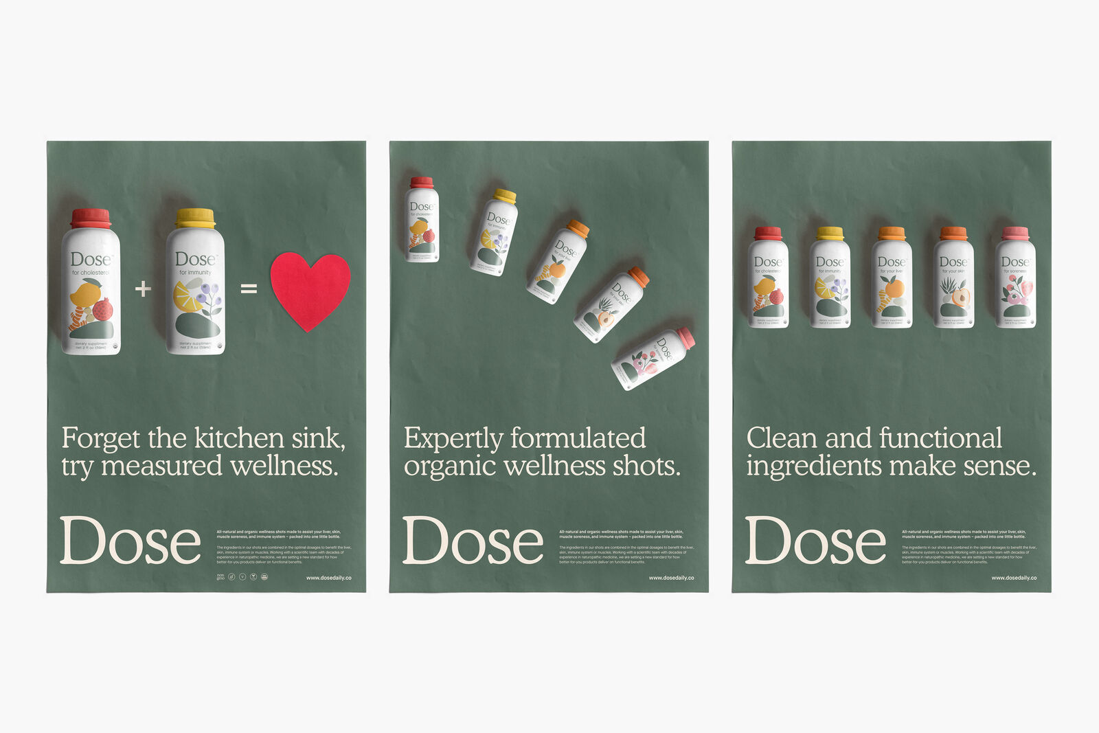
  • Posters

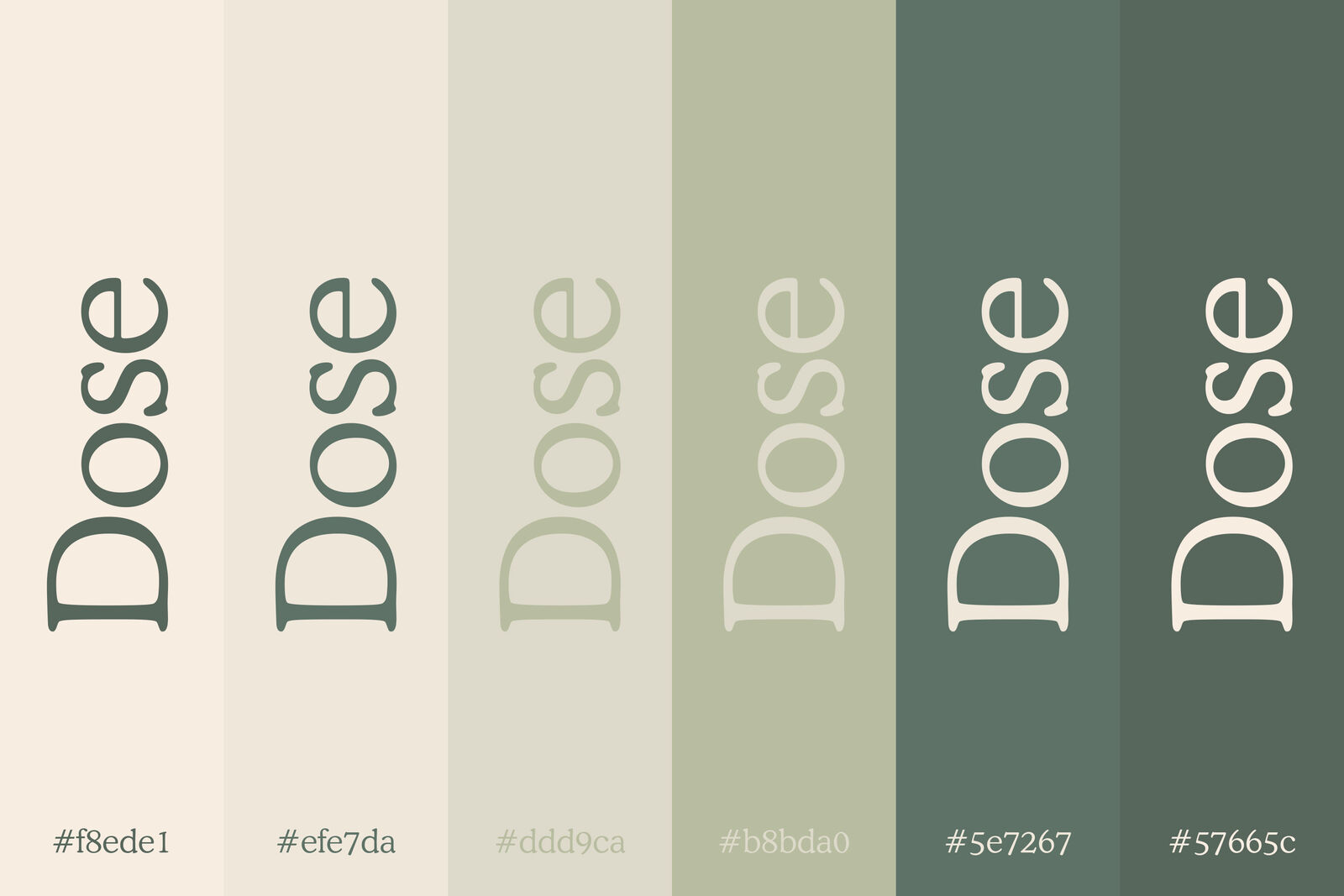
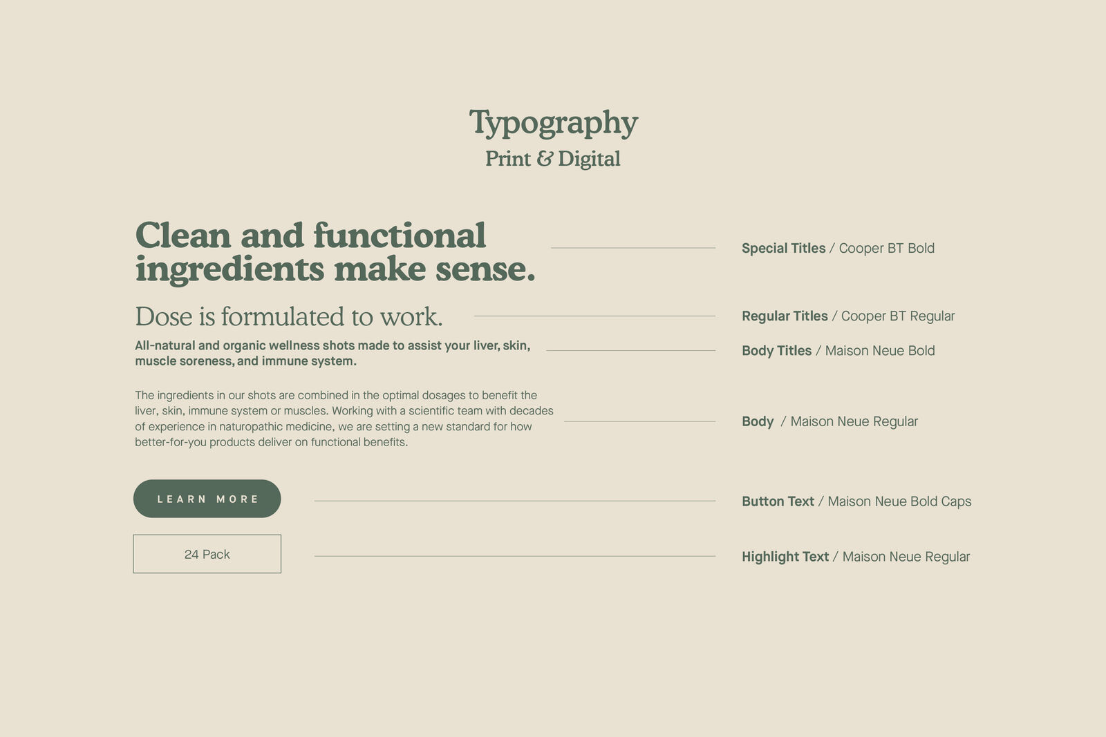
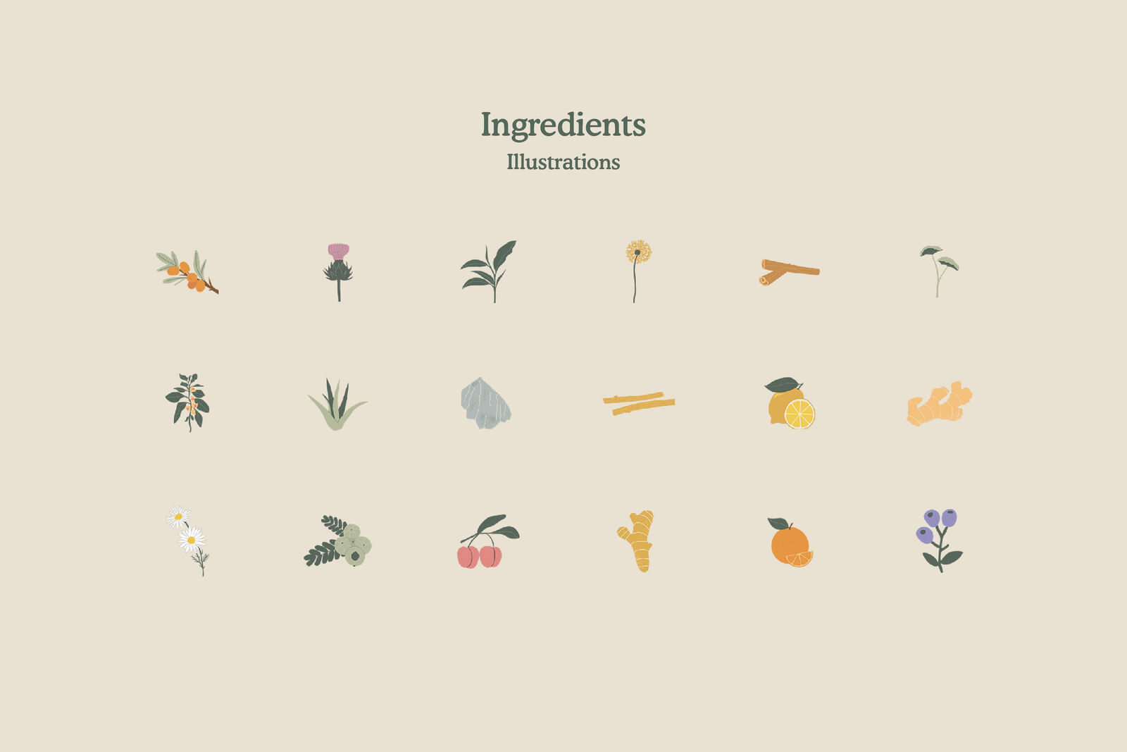
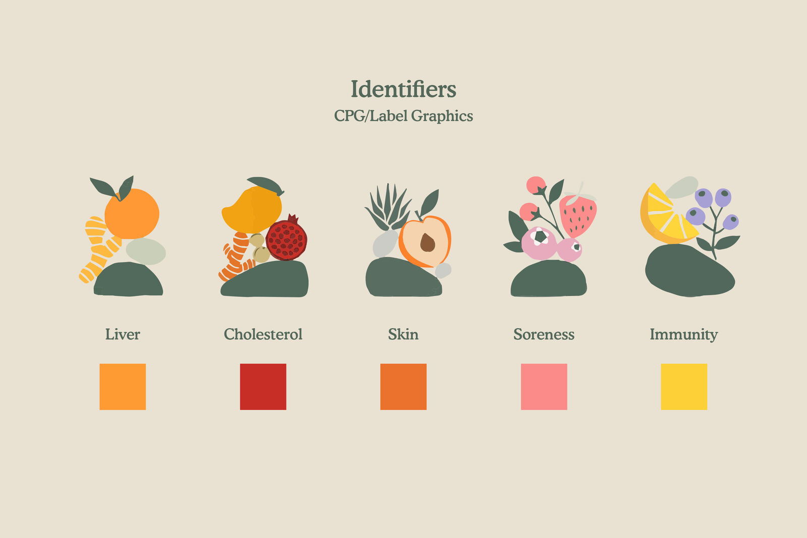
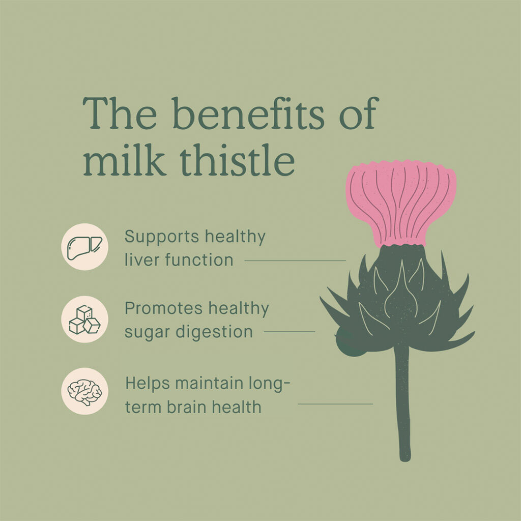
A disciplined identity turns a growing brand into something people can recognize before they read a word. Dose’s new palette, typography, and ingredient-led illustrations gave it a clear visual logic built to travel.

The palette was expanded to work hard across formats, while typography balanced authority with a sense of ease. From stationery and sales materials to retail touchpoints and apparel, every application tested the system—and proved it could stay coherent in the real world.

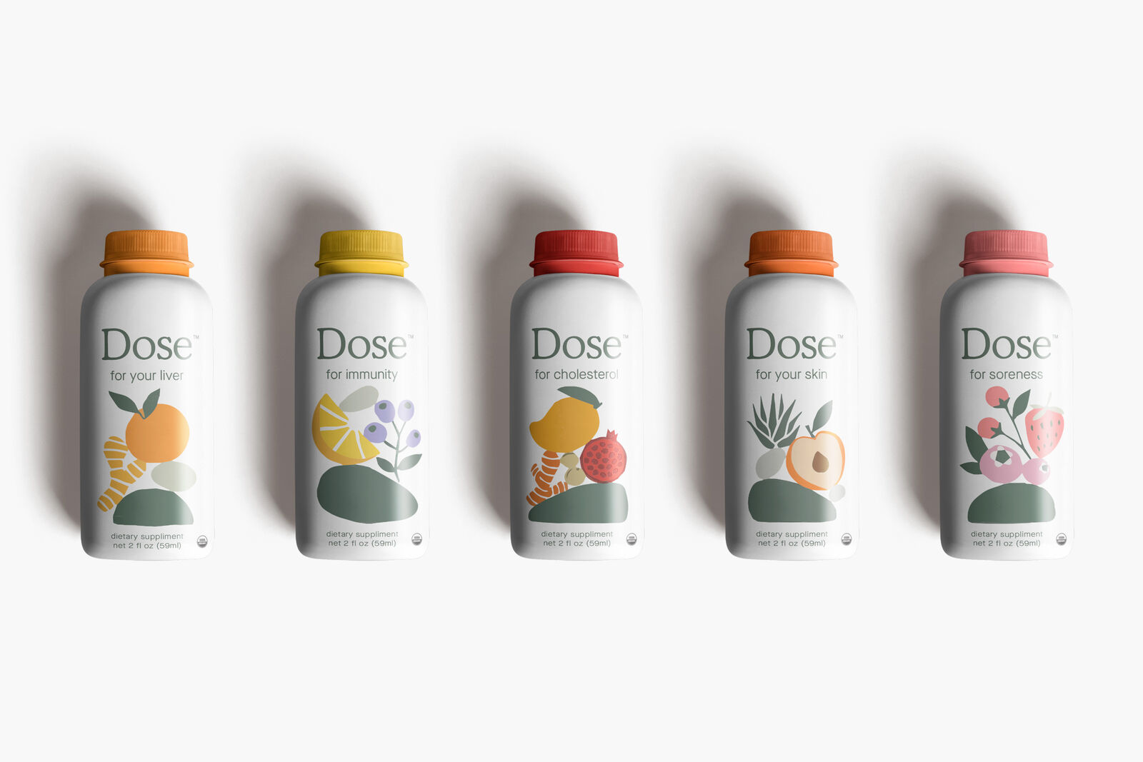
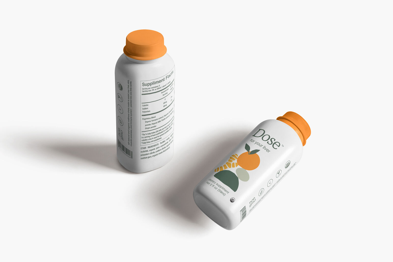
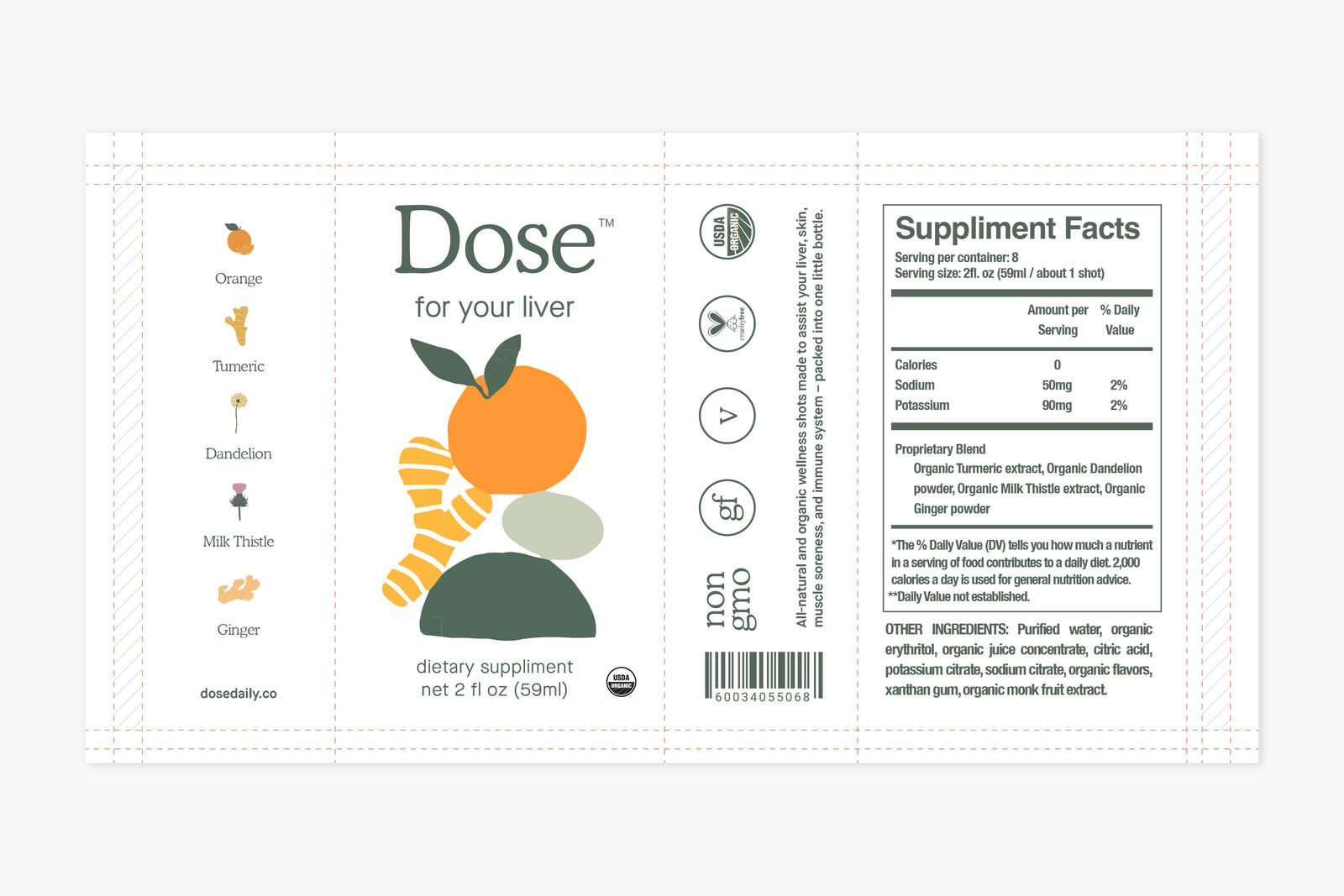
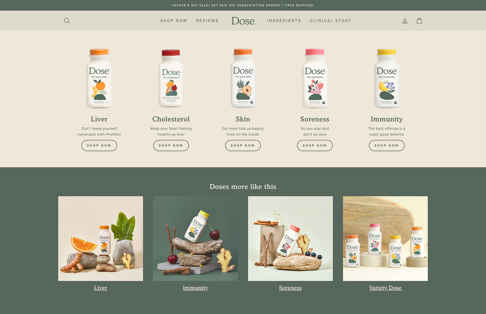
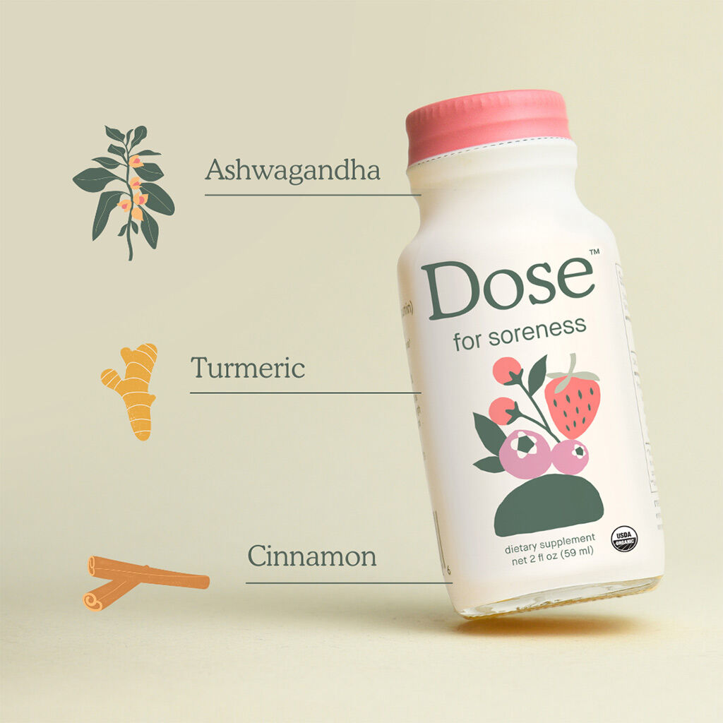
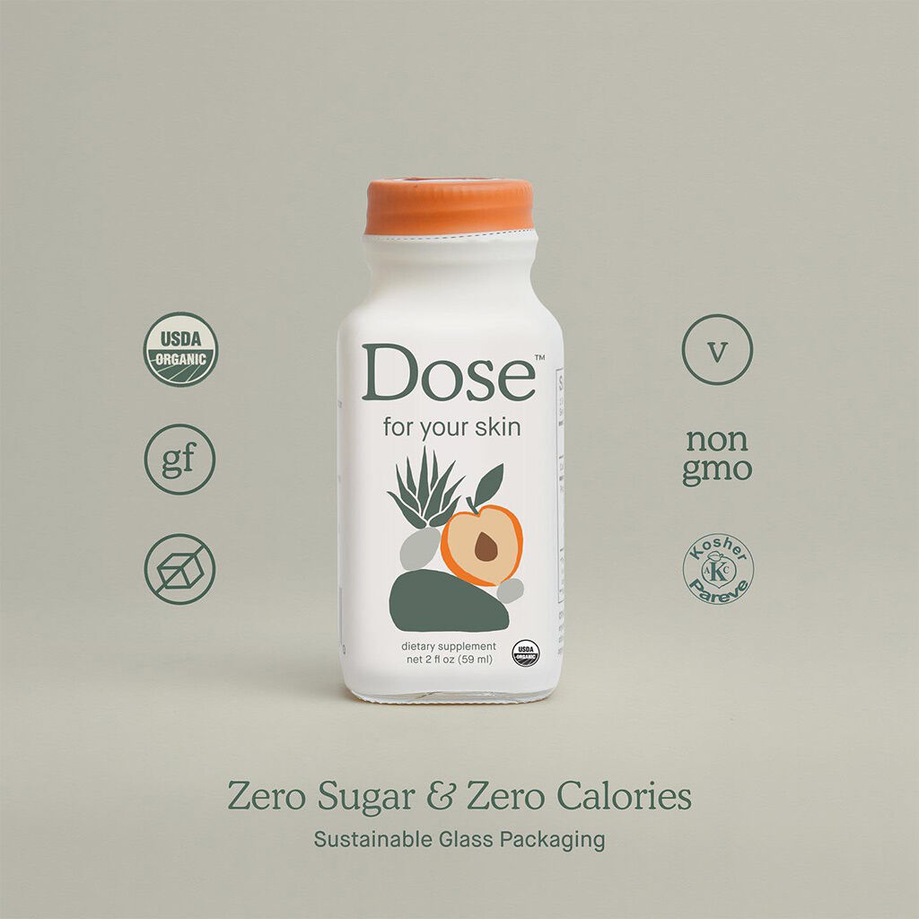
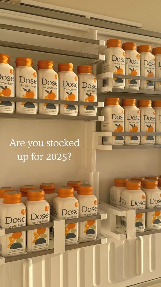
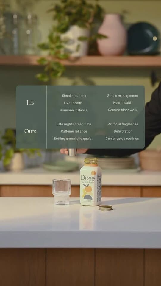
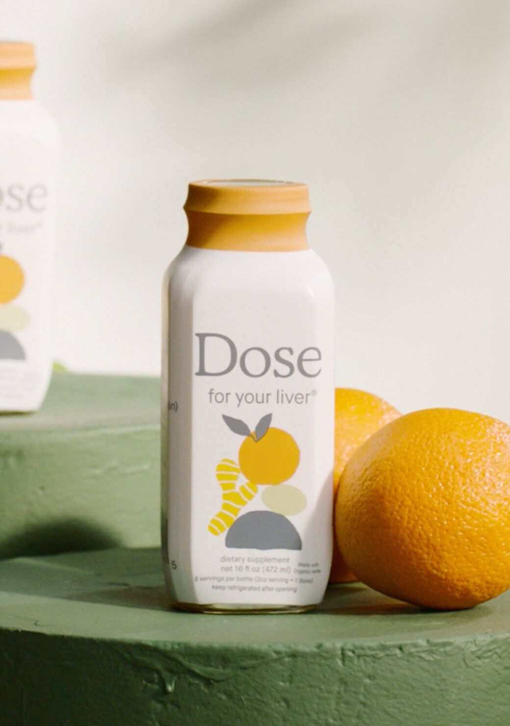
Each SKU runs on the same structural grid with the proprietary illustration system doing the storytelling that most brands try to do with copy.

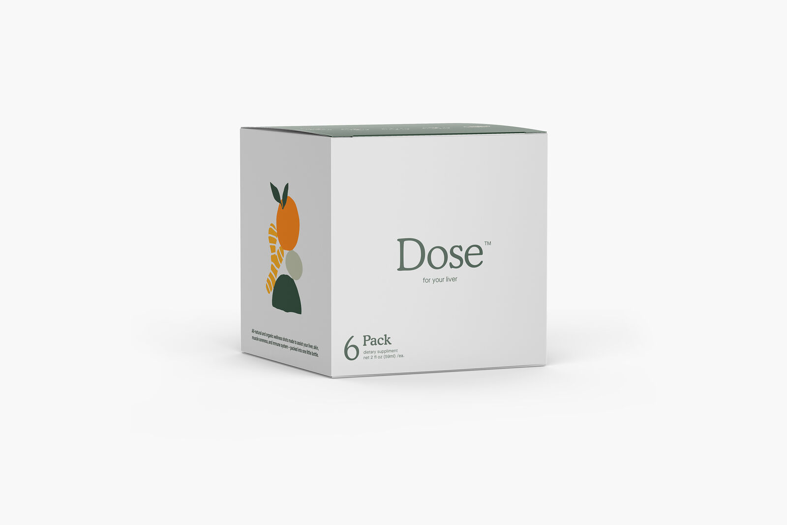
The ingredient compositions are unique to each variant but follow the same visual logic, so the line reads as a family on shelf without any single product getting lost in the crowd. Cap color is the primary differentiator between SKUs, restrained enough to stay coherent, distinct enough to navigate at a glance. The 6-pack box extends the same system into DTC packaging, carrying the illustration and layout logic from the bottle label into a format built for shipping and unboxing rather than shelf presence. Same brand, different job.

Positioning the brand for CTV

A 40-second explainer that had to do a specific job: communicate what the product does

The visual system carries straight through from static into motion, resulting in a piece of content that feels unmistakably like Dose regardless of where someone encounters it.

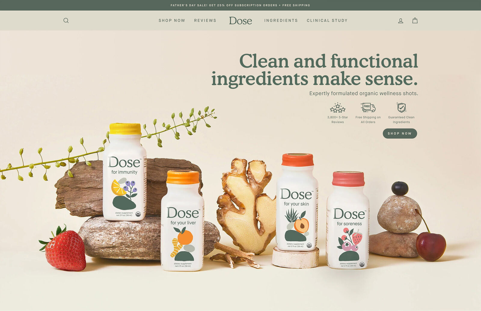
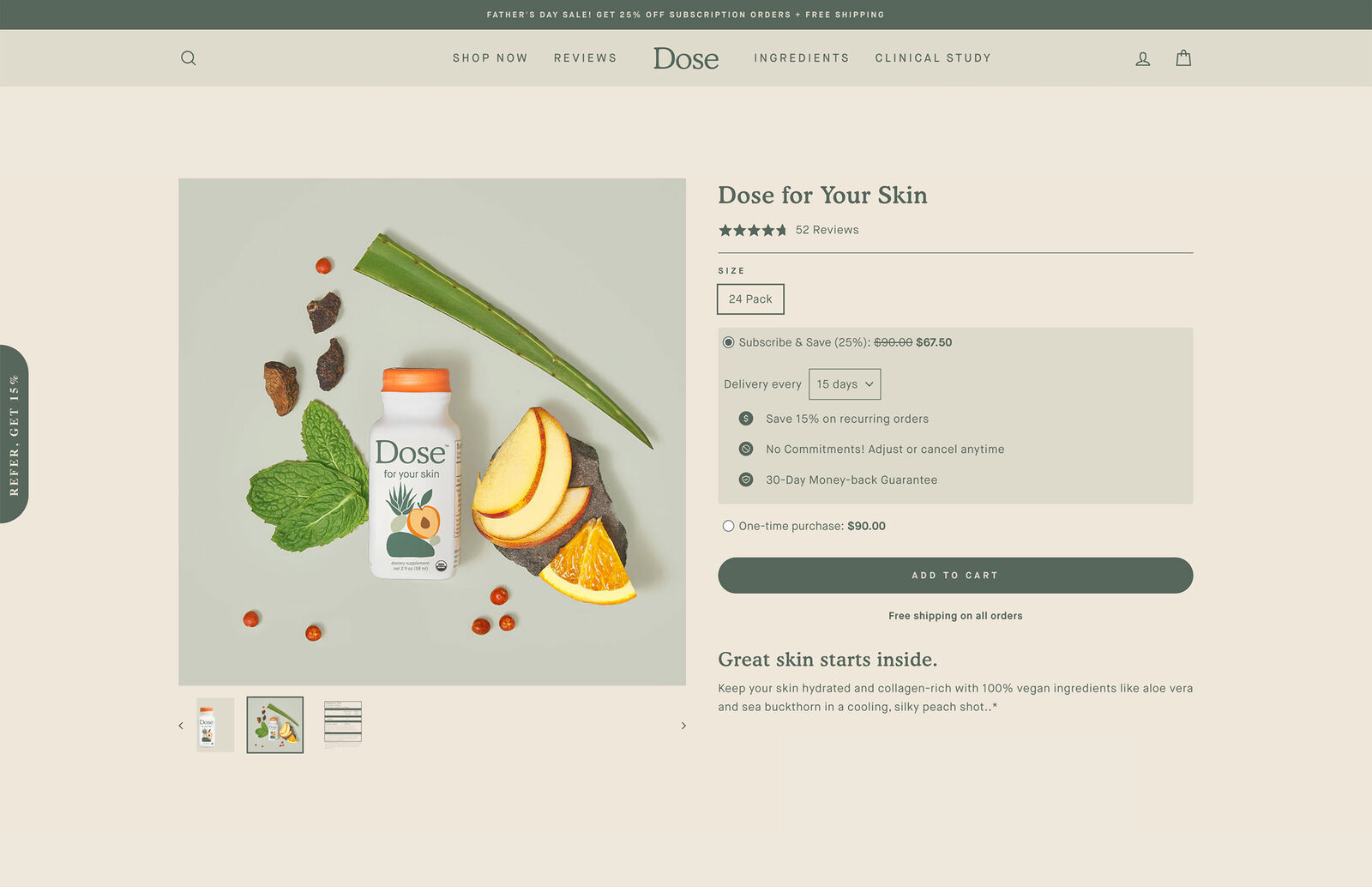
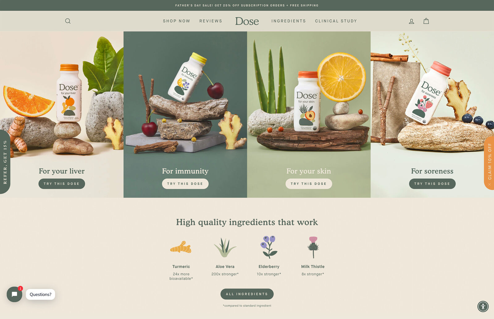
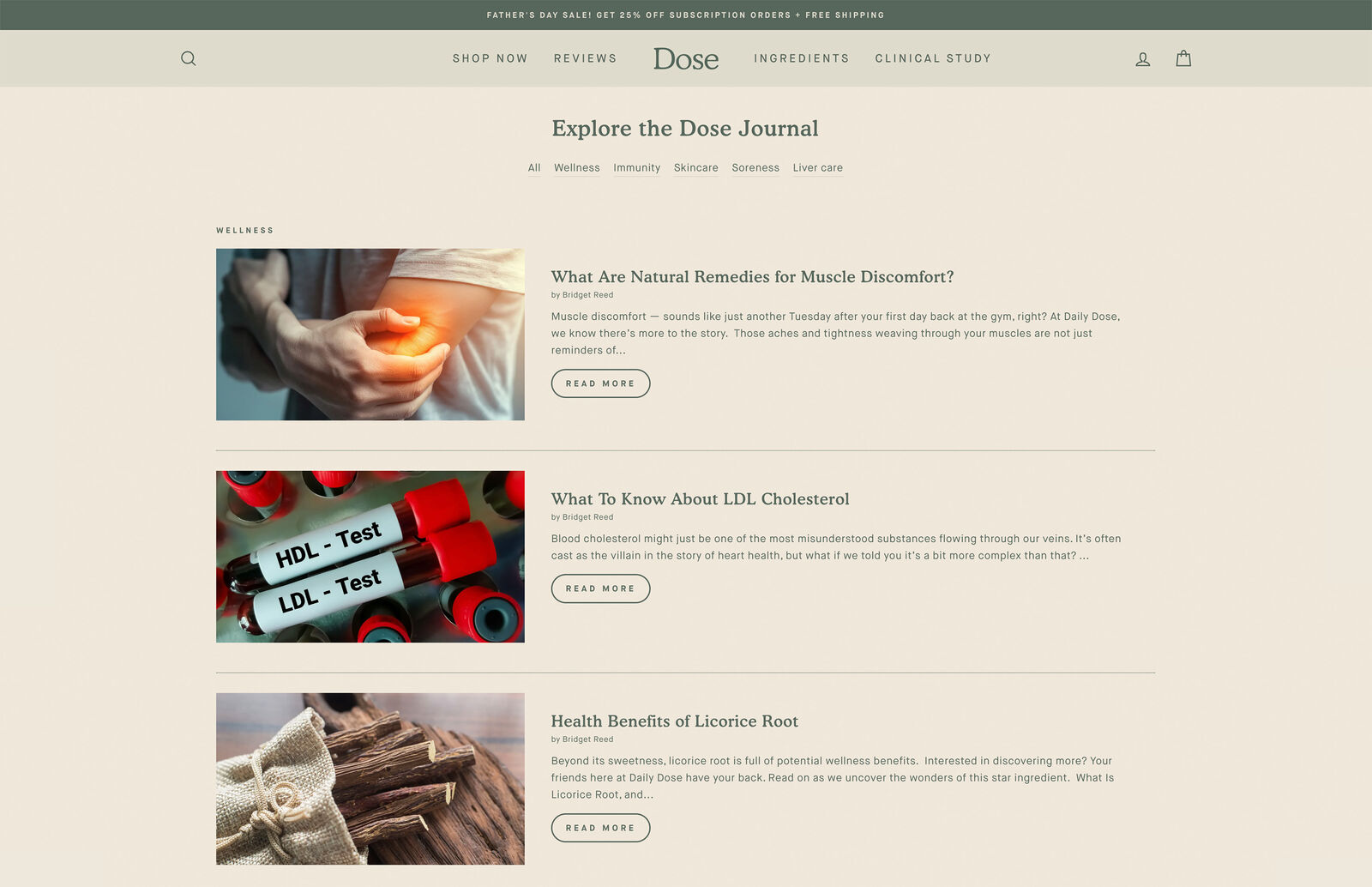
When the site and the packaging feel like the same brand, customers don’t have to do any mental work to connect them.
  • Subscription-first UX flow to drive recurring revenue over one-time purchases
  • Same typographic scale, color logic and illustration language as the packaging
  • Modular content blocks built for easy updates without breaking the layout
  • Clean navigation hierarchy that reduces friction at every step toward checkout
Dose OOH billboard
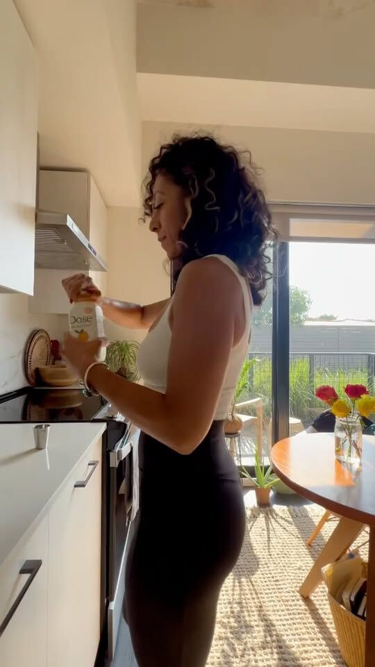
Dose faceless UGC video 1
Dose faceless UGC video 2
Dose faceless UGC video 3

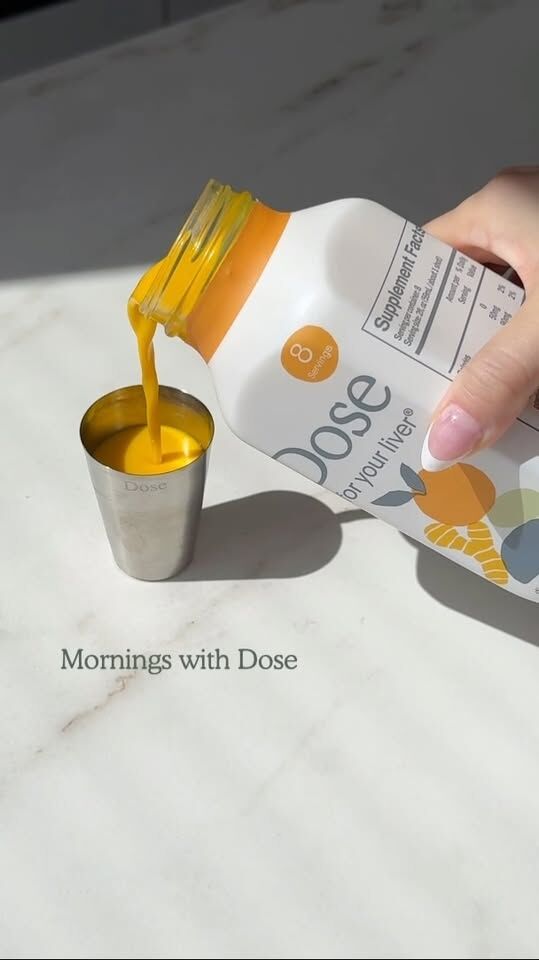
Social Content / Faceless UGC

Faceless UGC works particularly well for a product like Dose because the visual clarity does the explaining. No face needed when the product and its purpose are immediate.

  • Views

    0-90 Day

    1-5k (avg.)

  • Metrics

    0-90 Day

    .03% to 1.2% CVR

  • Cost

    0-90 Day

    $11 (down 44%) CAC

Dose on-camera UGC video 1
Dose on-camera UGC video 2
Dose on-camera UGC video 3

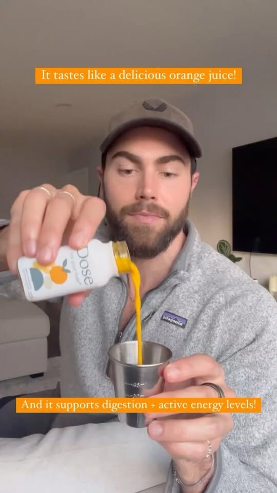
Social Content / On-Camera UGC

TikTok-style, creator-led content that extends reach and relatability without breaking the brand. The visual system was deliberately kept minimal enough to survive fast, iterative production without needing oversight on every piece.

  • Views

    0-90 Day

    2-6k (avg.)

  • Metrics

    0-90 Day

    .02% to 1.6% CVR

  • Cost

    0-90 Day

    $19 (down 37%) CAC

Dose paid & promotional video 1
Dose paid & promotional video 2
Dose paid & promotional video 3

Social Content / Paid & Promotional

The most polished execution layer in the social mix. Structured narratives, higher production value, same brand logic underneath. Each piece feels elevated without drifting from the system that holds everything else together.

  • Views

    0-90 Day

    5-10k (avg.)

  • Metrics

    0-90 Day

    .05% to 2.2% CVR

  • Cost

    0-90 Day

    $22 (down 18%) CAC

The Result

Most projects have a shelf life, this one is still working

What’s Measureable

  • Up to 44% Reduction in Paid CAC ($11)
  • 2.20% Peak CVR Across Paid & Promotional
  • 25k+ Avg. Annual Organic Growth via Social
  • 4+ Years Active System Longevity
  • 100% Cross-Channel Rollout

Creative systems thinking.
This is what I love to do.

The agency hands off the files, the internal team starts improvising, and six months later the whole thing has quietly fallen apart. That didn’t happen here. What we built is still the foundation Dose operates from today.

The packaging, the digital experience, the content templates, the illustration system — all of it still running, still scaling, still being used by an internal team that never needed me in the room to keep it going. That’s not luck. That’s what happens when a system is built with enough discipline to survive without its author.

*Some of these designs are client concepts only, and may not have been used in production.

Other Projects