Y-Lofts
Brief
Client
Industry
Scope
Role
Atria/PrismPM
Real Estate
Omni-Channel
Design Director
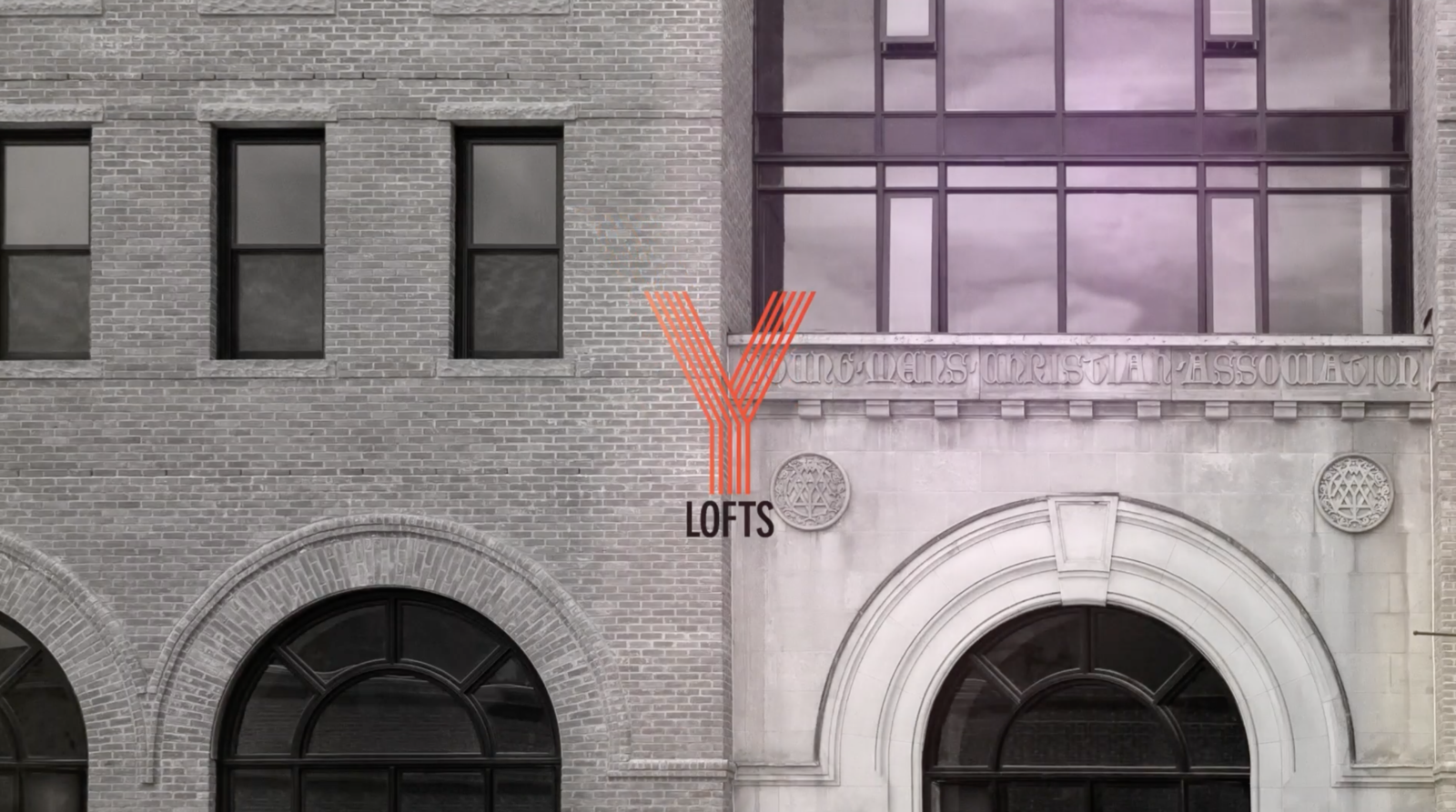
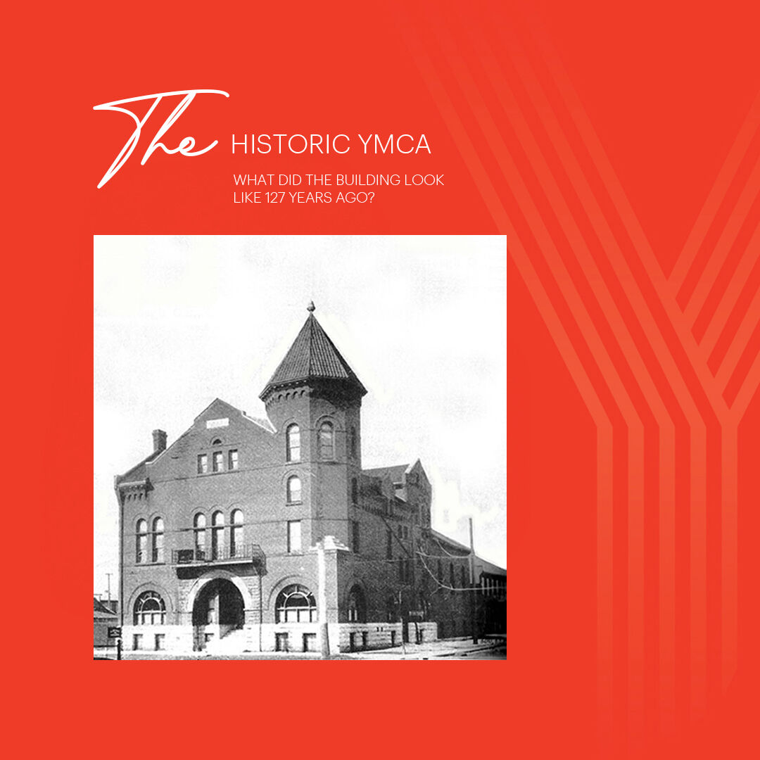
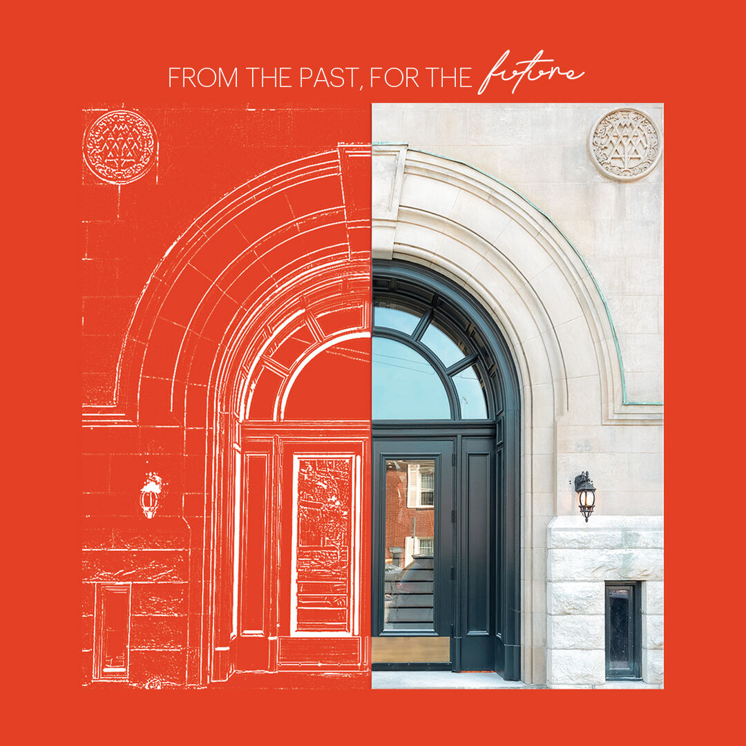
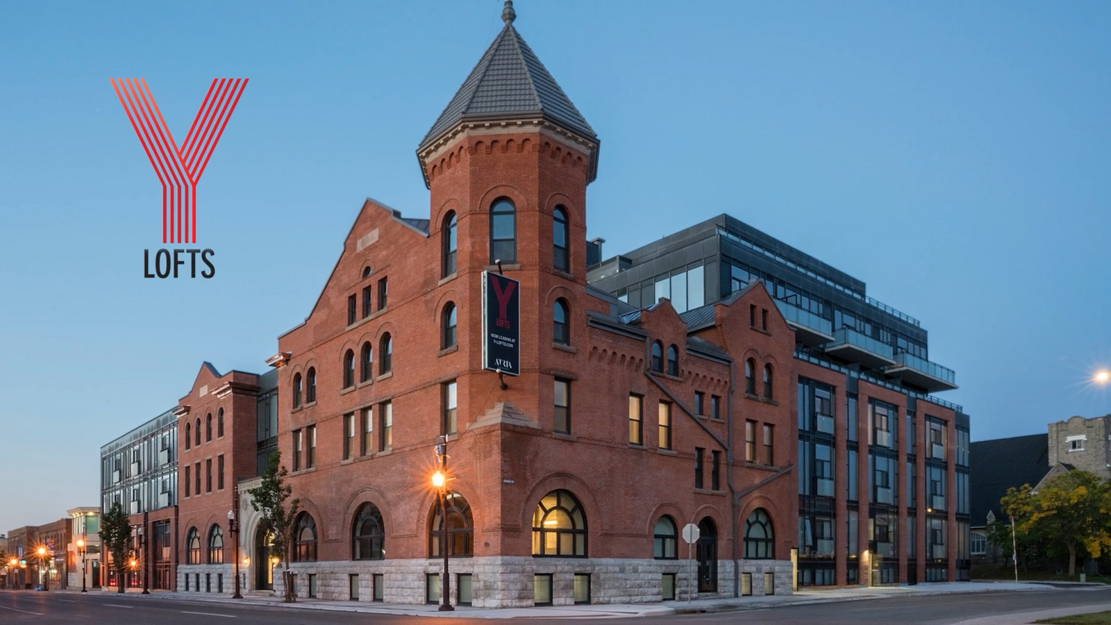
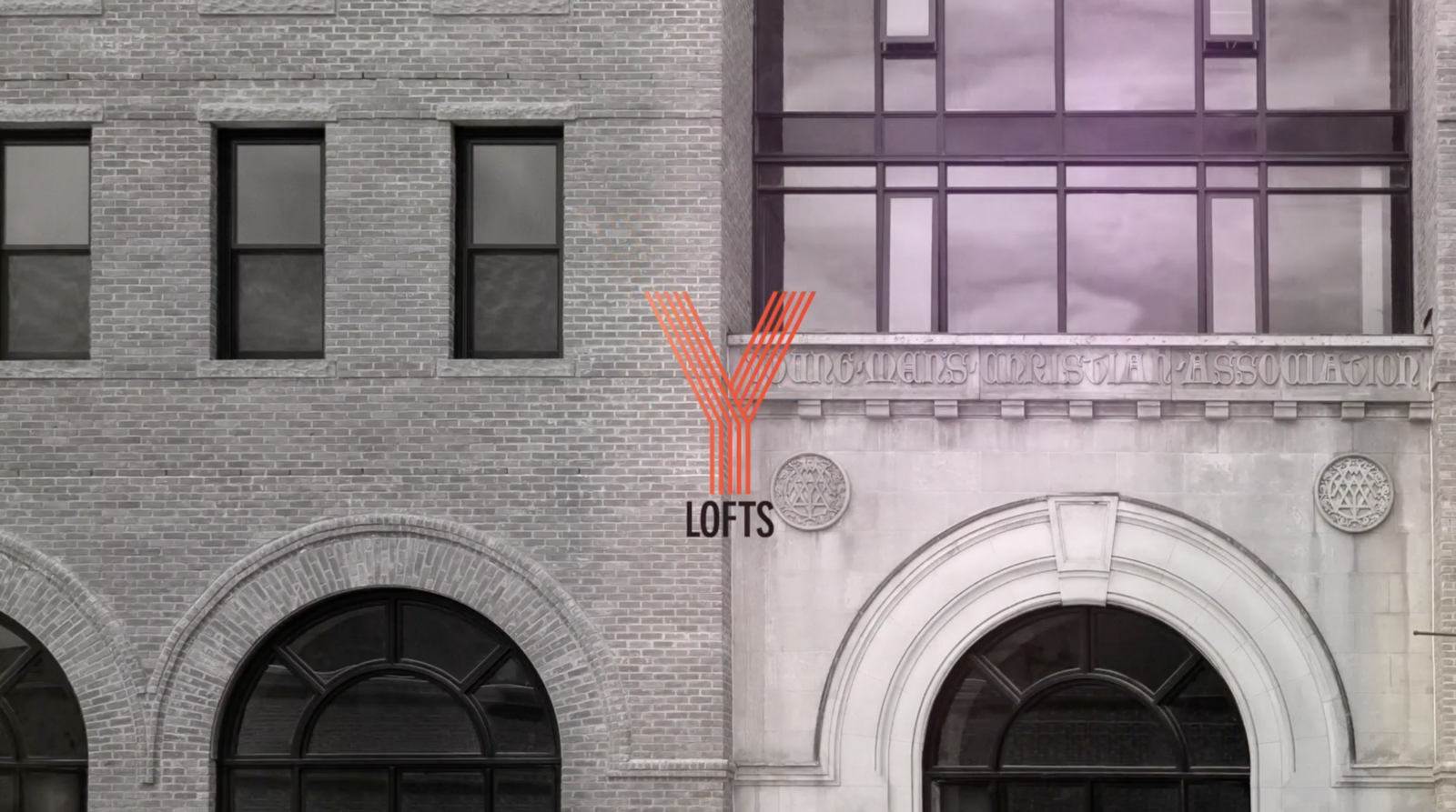
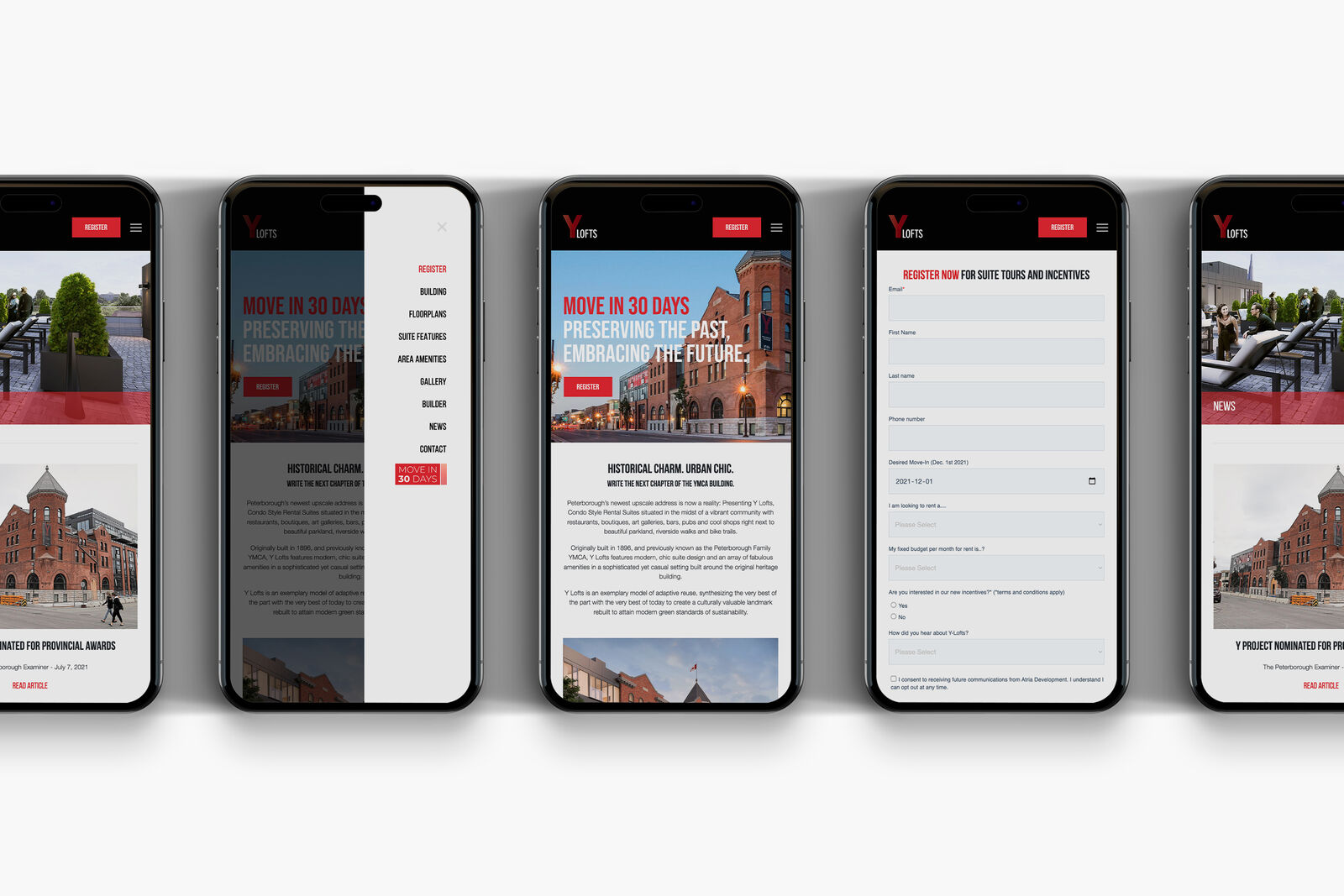
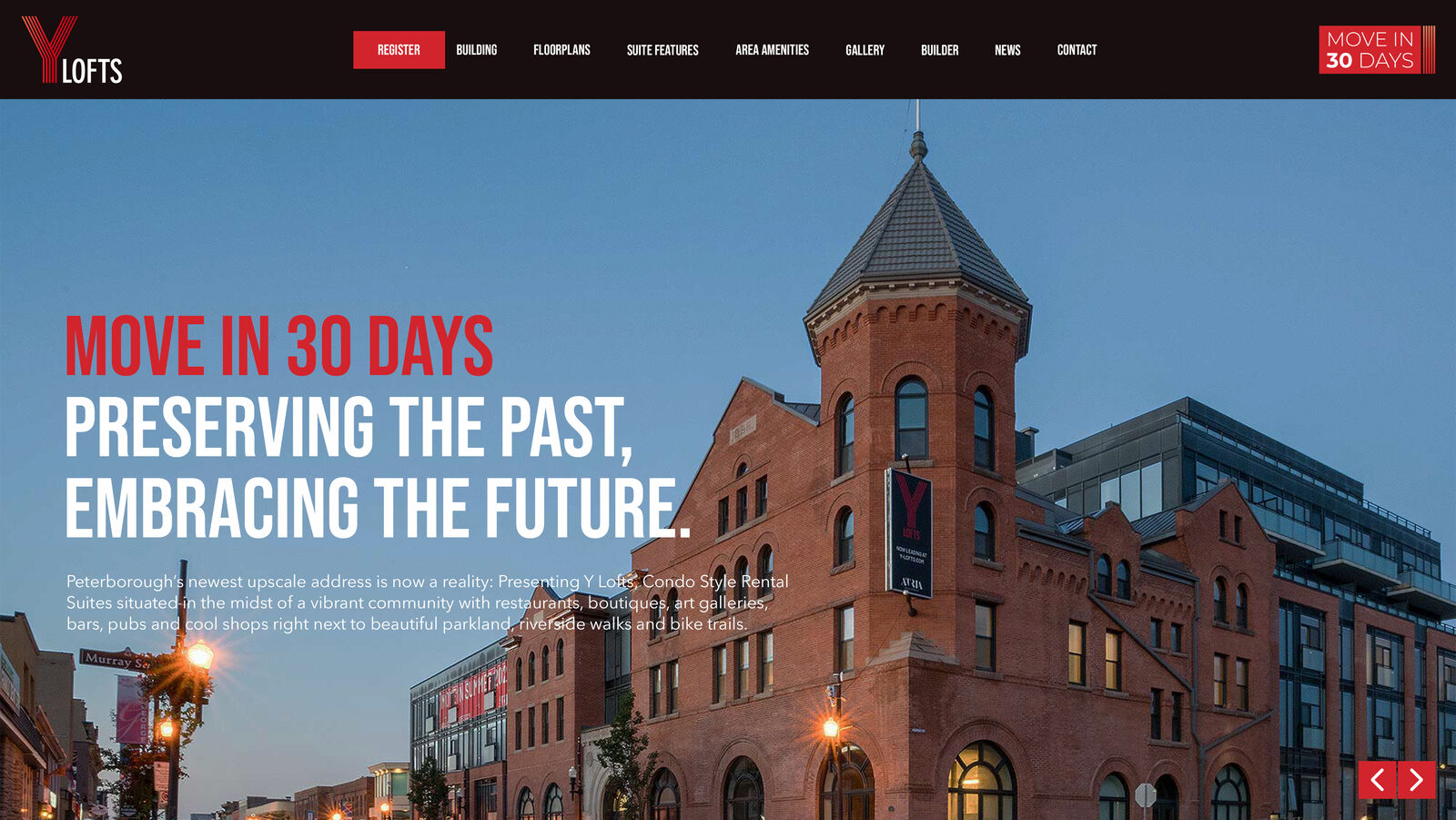
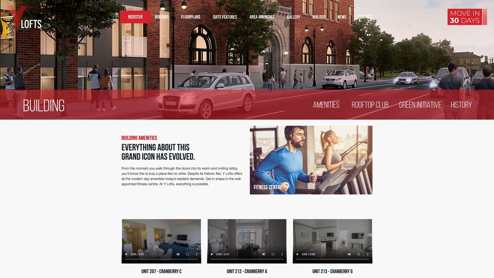
The brand needed to hold two ideas at once, honouring a building with real history while selling a brand-new way to live in it, so the identity pulled the Y mark straight from the building's own architecture and paired it with a bold, confident red against black-and-white photography of the original brickwork. From there the work carried that identity across everything needed to fill the building fast: teaser and investor videos, a leasing website, a premium-print brochure, and OOH on-site and across the GTA.